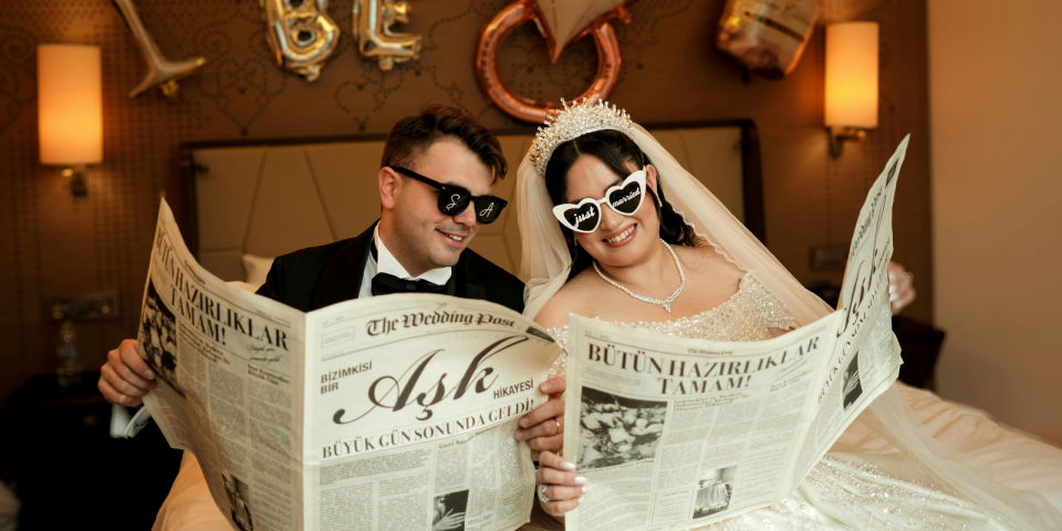
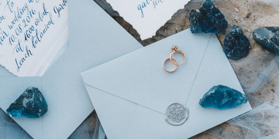
Looking for wedding website examples? You’re in the right place! Wedding websites are the ultimate tool for couples looking to simplify the RSVP process and share important event details with guests. From personalized designs to seamless user experiences, a well-crafted wedding website helps keep everything organized and ensures your guests stay informed leading up to the big day.
At WedSites, we understand how important your wedding website is in setting the tone for your big day. It’s not just a place for guests to RSVP — it’s a reflection of your unique love story, style, and vision. Whether you’re dreaming of a modern, minimalist design or something more colorful and creative, we’ve seen couples use our customizable templates to craft sites that are as unique as their celebrations. From stunning color palettes and custom illustrations to fun playlists and personalized details, your wedding website can be as personal and practical as you want it to be.
Follow along as we share beautiful wedding website examples to inspire your own design, along with expert tips to help you create a site that’s not only visually striking but also easy to use and navigate.
1. Megan and Zach
Template used: Denver
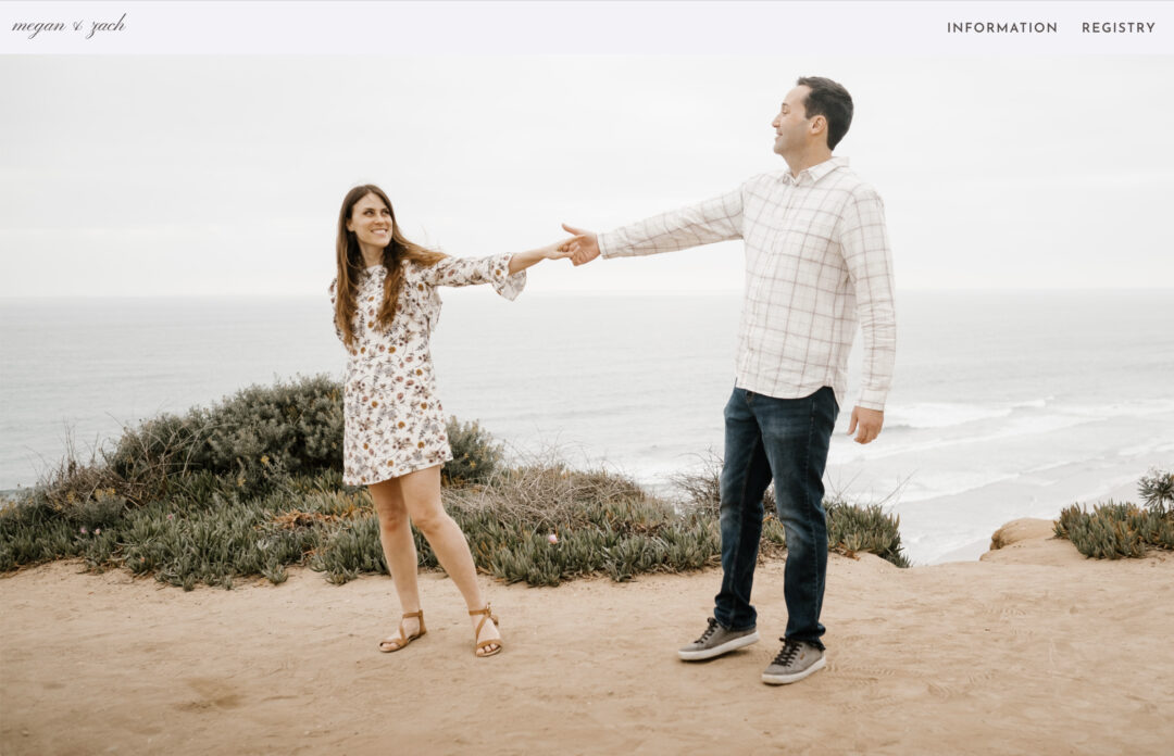
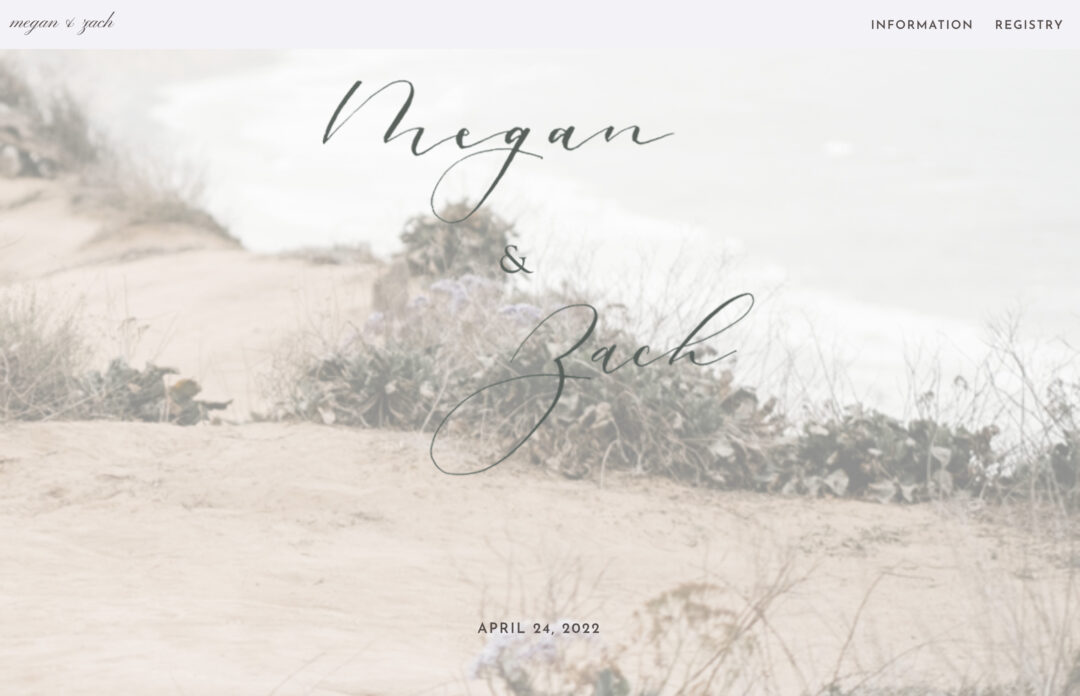
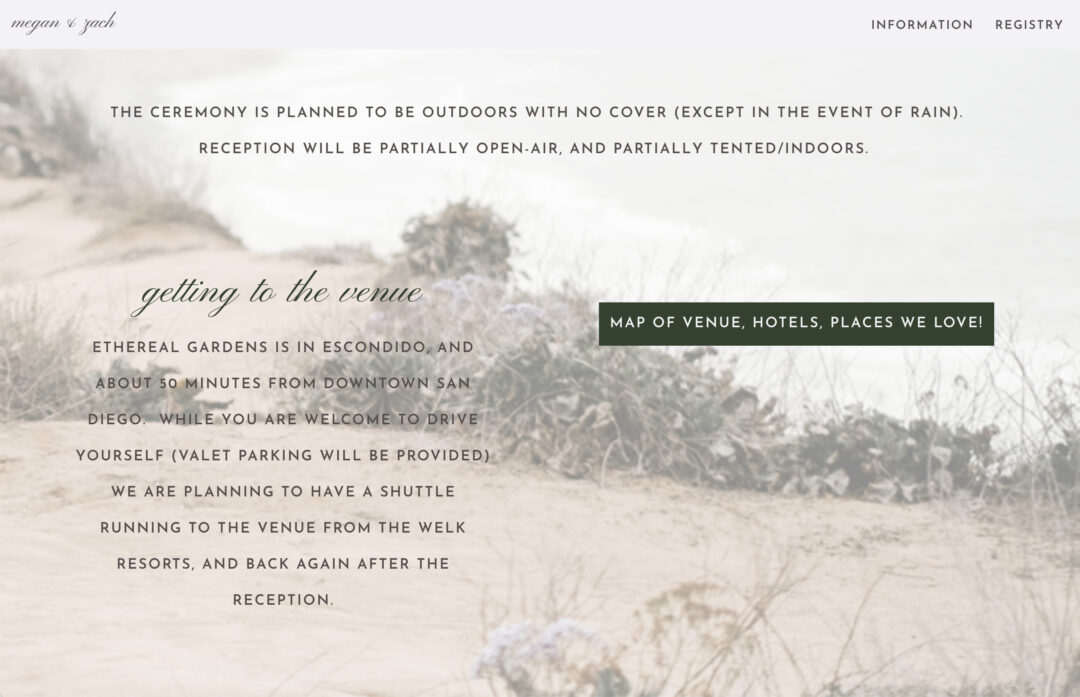
Why we love it: Megan and Zach have done a fantastic job at using images to personalise their wedding website. The first thing you see is a beautiful, high-quality header image that fills the screen – and as you keep scrolling, you can see they’ve tied the look together using a custom background image, too. We love the organic colour palette of soft greys, greens, and browns that flow throughout their website.
Megan and Zach have also taken great care to communicate venue directions and accommodation suggestions to their loved ones. They’ve even created a clever custom map on Google with checkpoints of their favourite places to help guests build the perfect weekend itinerary!
2. Jessica and Alexander
Template used: Melbourne
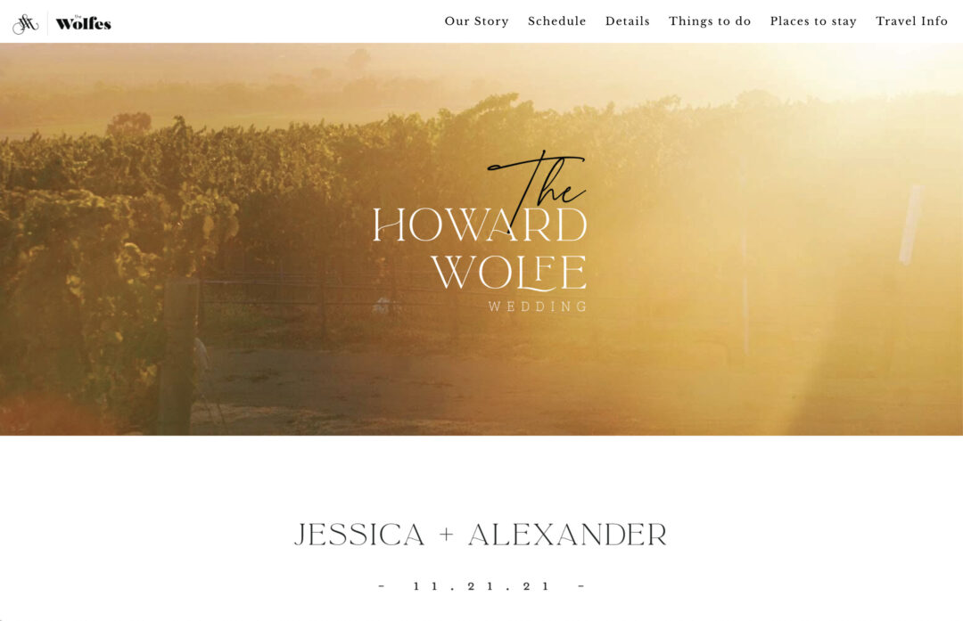
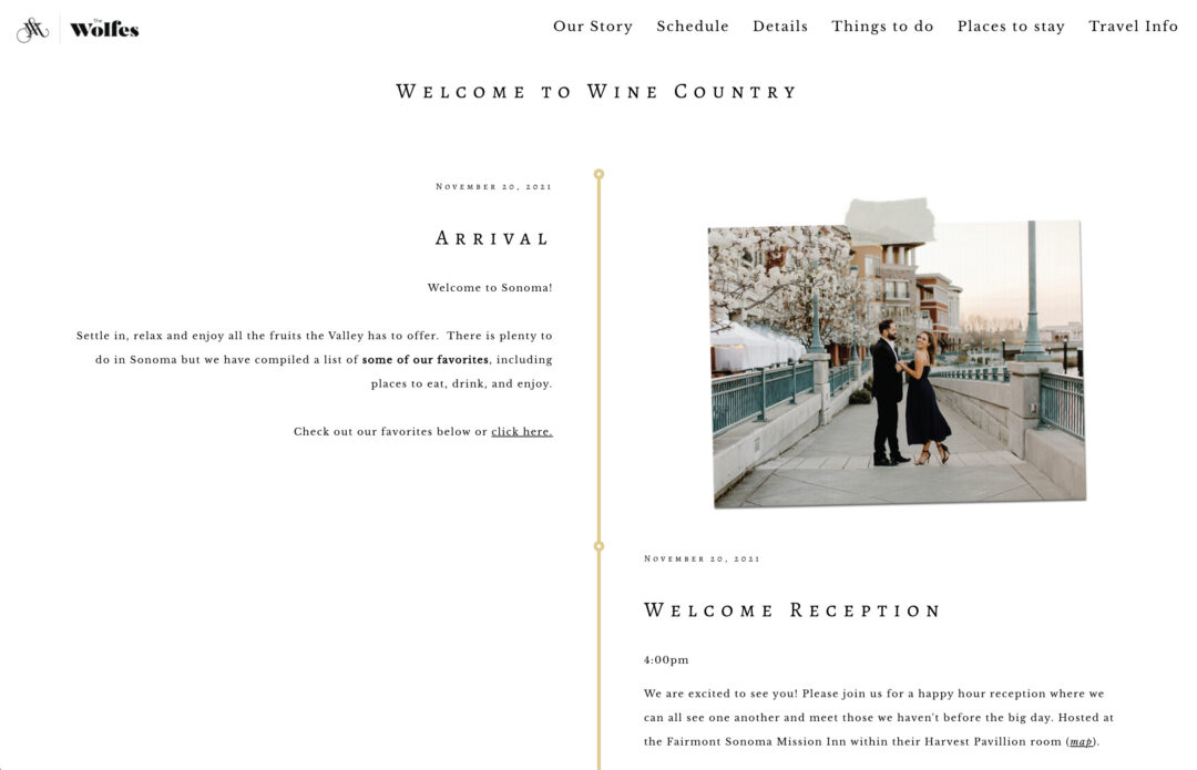


Why we love it: Jessica and Alexander have used a range of bespoke design elements to create an incredible wedding hub for their guests. Nearly every element of their wedding website has been personalised to suit their vision – from the custom menu logo, header, and footer image to the custom illustrations and calligraphy headings. The end result is a completely unique wedding website that immediately sets the tone for their upcoming celebration.
Along with their custom design, Jessica and Alexander have also nailed the communication side of things, too. From travel and accommodation info to bridal party introductions, they’ve covered all bases to prepare their guests.
3. Michael and Kalia
Template used: Melbourne
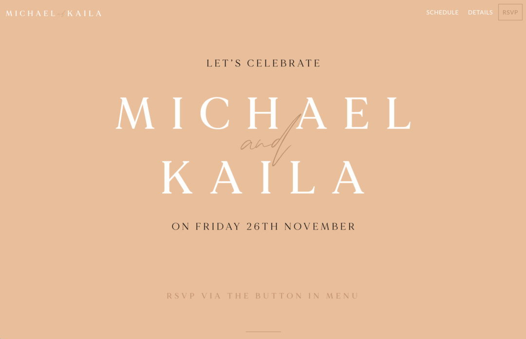
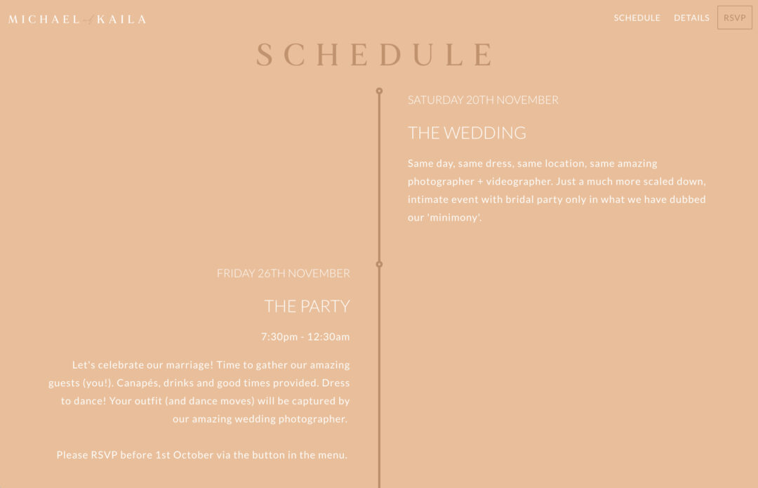
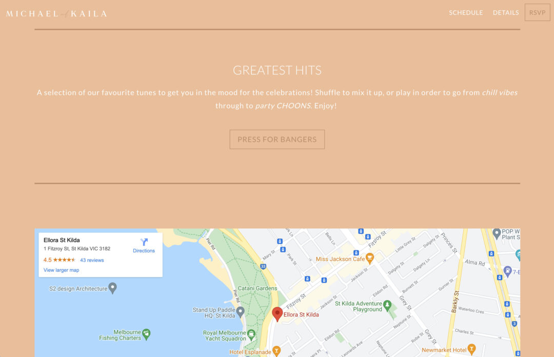
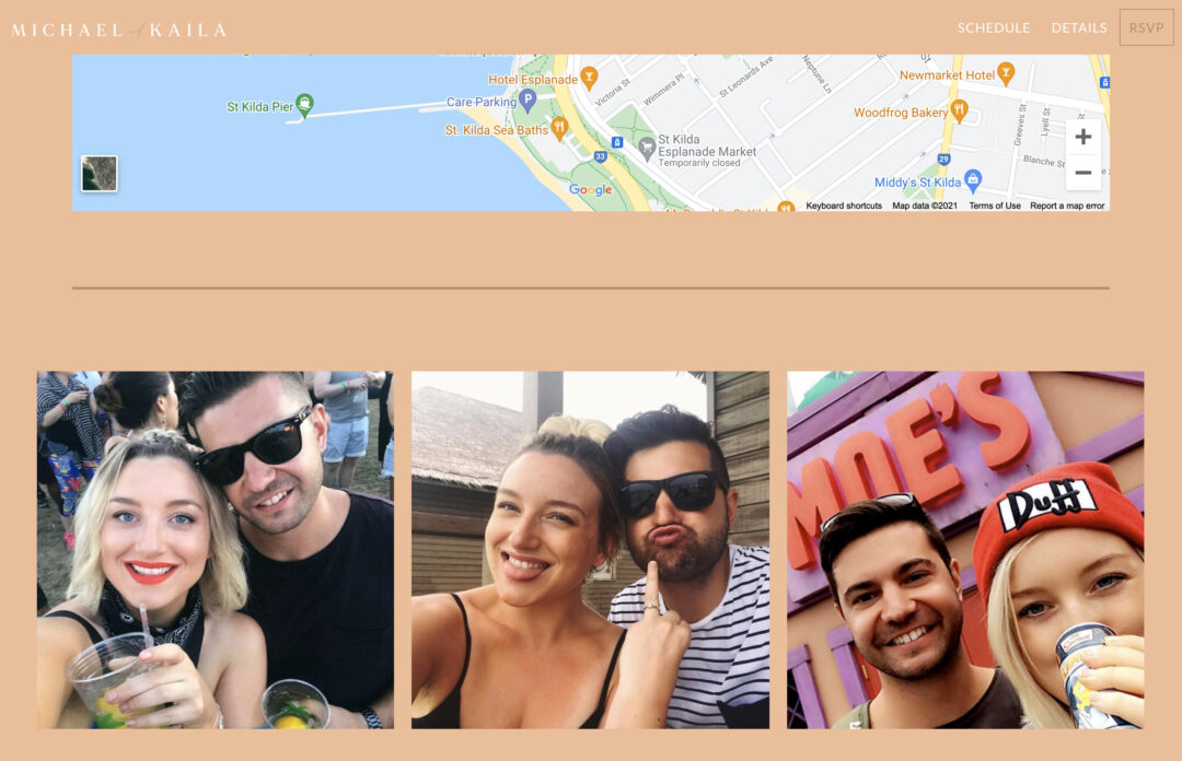
Why we love it: If you’re planning your wedding during COVID-19, be inspired by Michael and Kalia’s wedding website! Amidst changing rules and restrictions, these two decided to host a “minimony” with close friends and family, followed by an after-party at a later date. We think you’ll agree they’ve done an expert job at communicating this with their guests.
Along with including all of the relevant wedding details, Michael and Kalia have also used a beautifully warm colour palette with personalised elements, including a custom header image, custom header logo, and custom RSVP menu button. Our favourite part? The duo has included a link to their favourite tunes to put guests in the mood for their celebrations. What a way to set the vibe!
4. Kate and Trevor
Template used: Denver

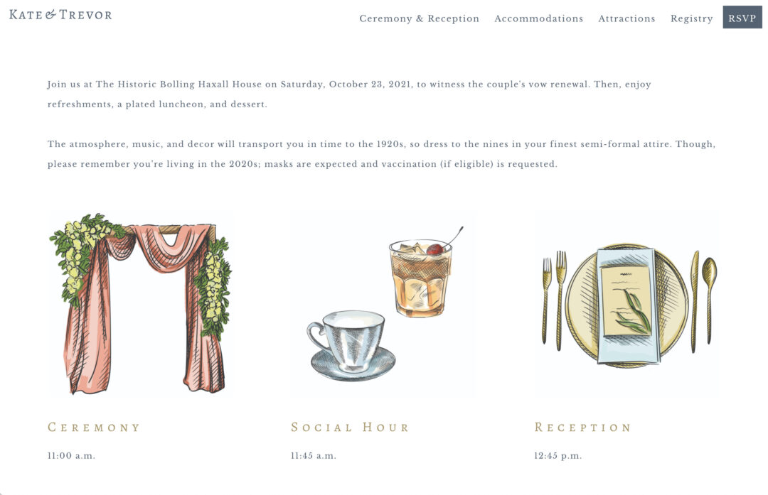
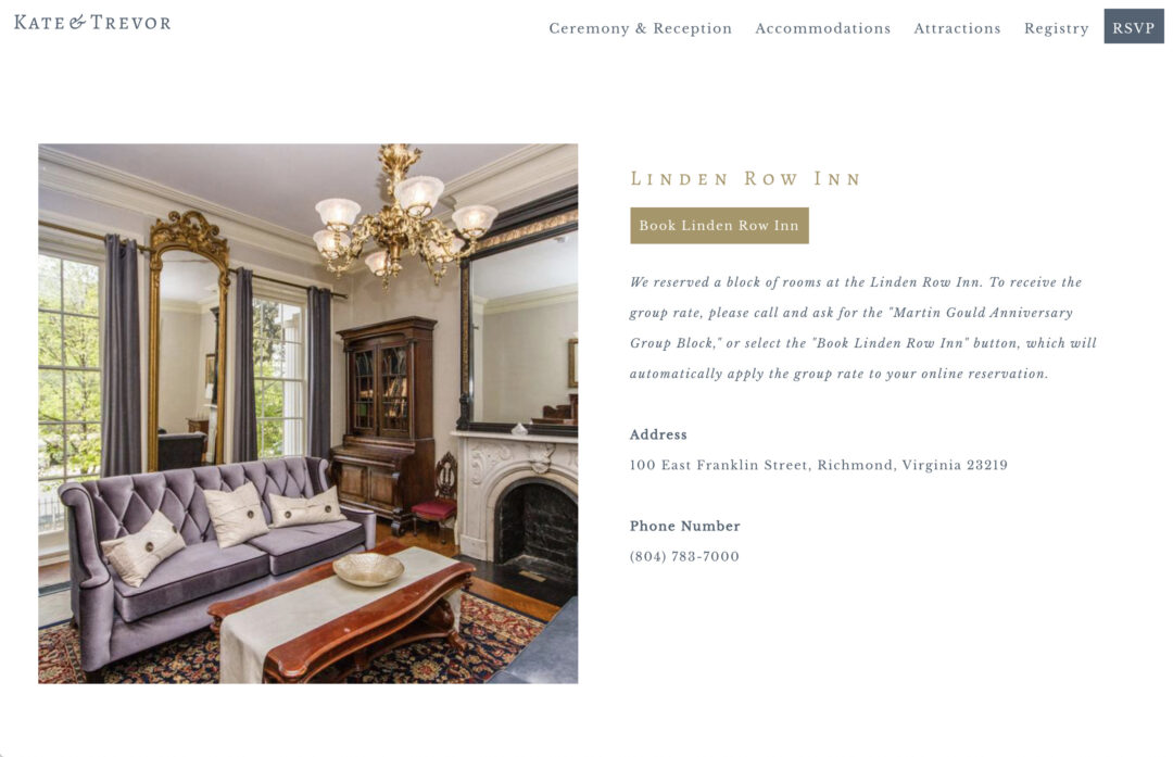
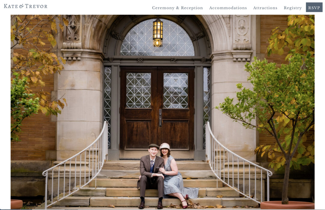
Why we love it: Kate and Trevor put a personal stamp on their wedding website by using a custom header logo and a custom header background. We also love the custom illustrations that have been used to display the schedule of events – so sweet!
For out-of-town guests, Kate and Trevor have done an amazing job showcasing the city of Richmond, complete with beautiful imagery and accommodation suggestions for their loved ones.
5. Freya and Tom
Template used: Denver

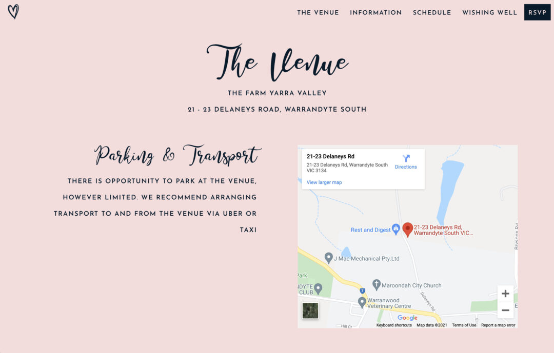
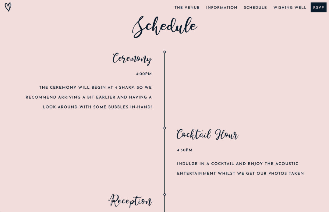
Why we love it: If you’re looking for something sweet and simple, you’ll love the vibe of Freya and Tom’s custom wedding website. Using a minimal blush and black colour palette, these two have incorporated a custom menu logo and custom header paired with beautiful brush lettering.
Freya and Tom have also nailed the layout of their wedding website – breaking down all of the essential info for their guests by using separate pages for their venue details, wishing well, and schedule for the day.
6. Jaime and Meli
Template used: Hampton

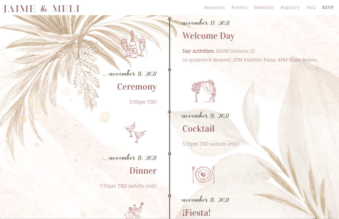


Why we love it: Jaime and Meli’s wedding website is a perfect example of using custom design elements to create something special! These two have included a custom header image, a custom logo, and a custom background, along with stunning illustrations to display their wedding day timeline.
We also love the detail that has gone into sharing their proposal story, and the fact that they’ve created a comprehensive FAQs page (in English and Spanish) to address questions around dress code, registry details, kids, and plus-ones.
7. Allie and Gavin
Template used: Denver
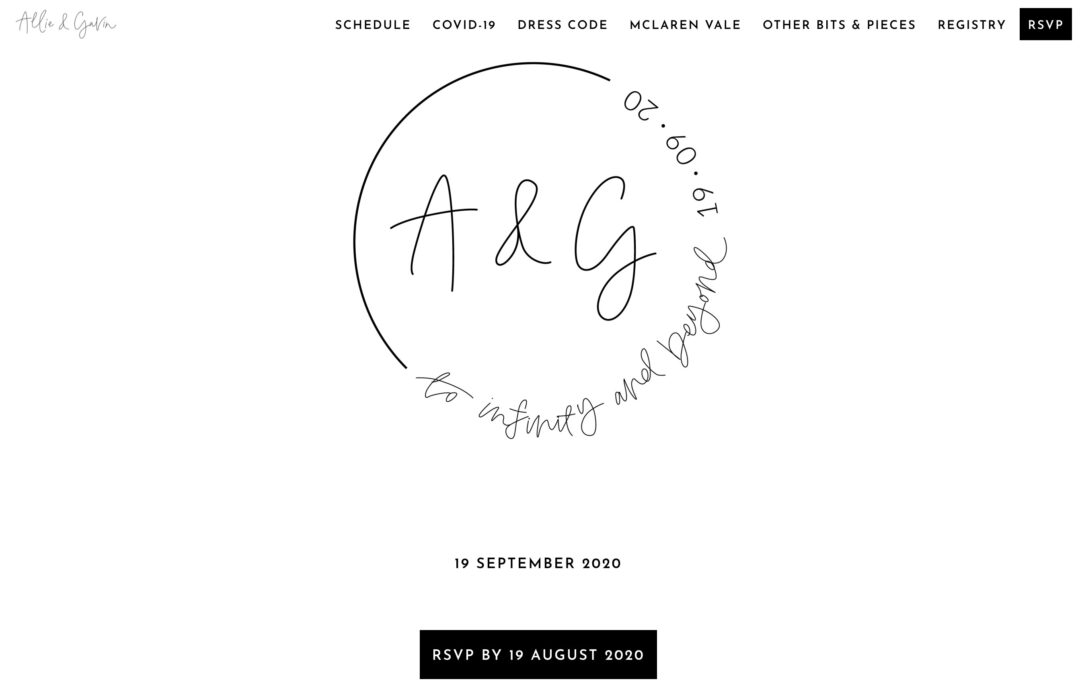
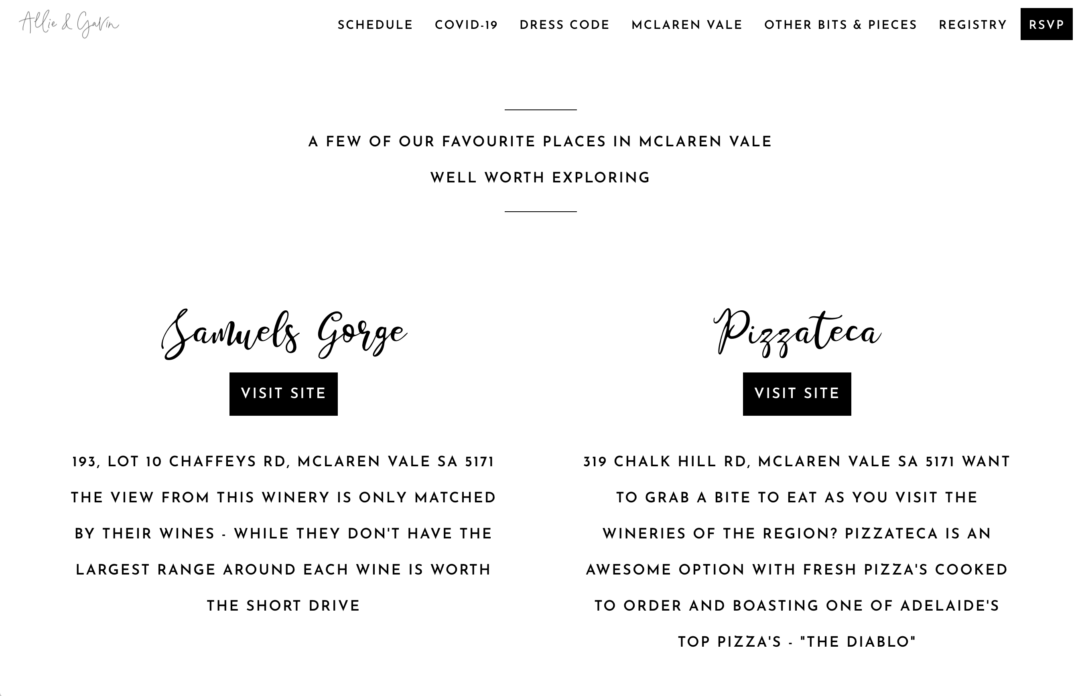

Why we love it: If you want to match your physical invitations with your wedding website, take a leaf out of Allie and Gavin’s book. These two have used a custom emblem designed by their calligrapher, The Blackline Bottega, as a way to create a cohesive experience for their guests.
We love that their wedding website is clean, modern, minimal, and super easy to navigate. They’ve used separate pages to share their timeline, venue details, and dress code, along with some helpful notes around COVID-19 safety for their guests.
8. Mirielle and Robert
Template used: Dauphin
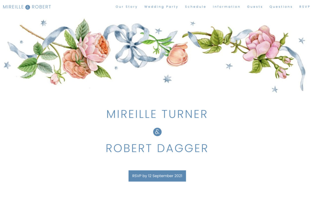
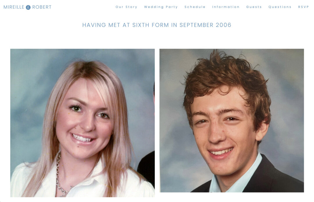
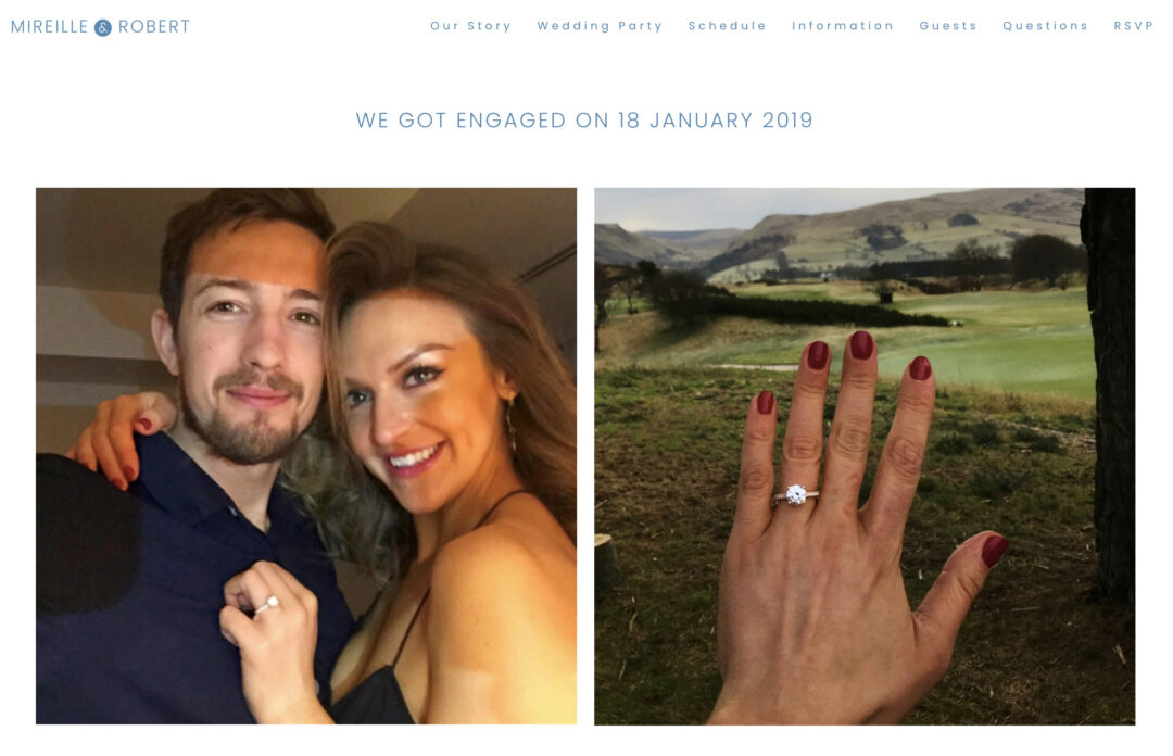
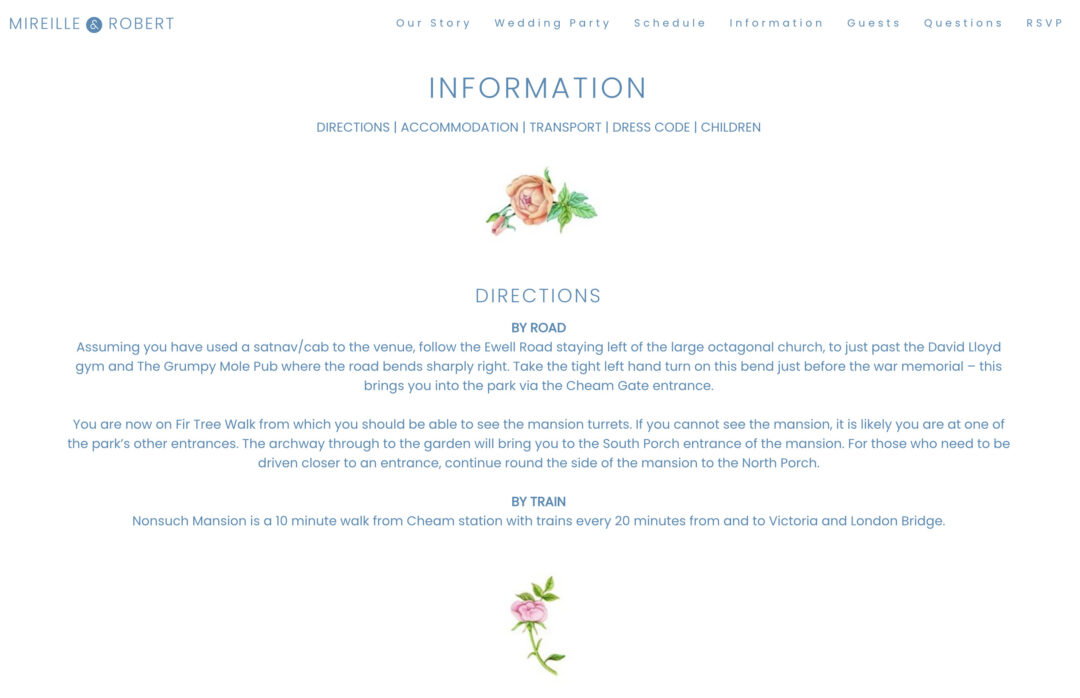
Why we love it: How beautiful are those floral illustrations?! Mirielle and Robert have used image sections to upload their own custom illustrations throughout their website, making it truly one-of-a-kind. They’ve also done an incredible job telling their love story – sharing photos from their first meeting back in 2006, right through to their engagement.
We love the cheeky bridal party introductions, and the fact that the RSVP button is front and center, making it super easy for guests to respond. Mirielle and Robert have also included an interactive “Questions” page for their loved ones to sing out with any queries.
9. Leah and Matt
Template used: Melbourne


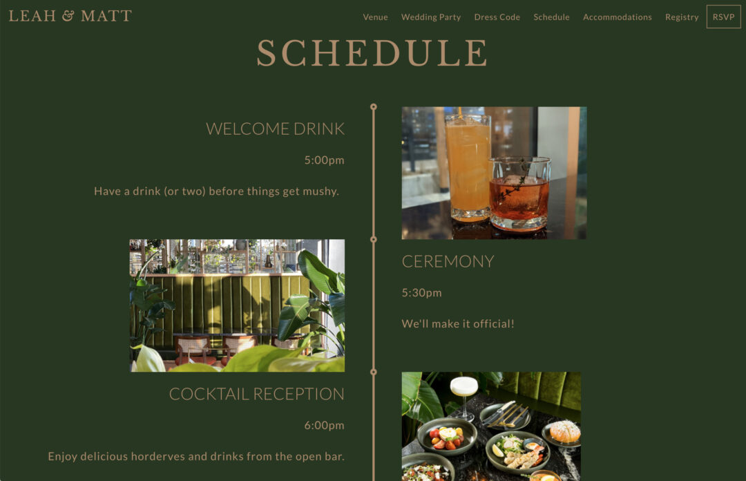
Why we love it: That colour palette! Leah and Matt have created a striking wedding website using bold olive green and gold to set the tone for their special day. These two have also incorporated stunning imagery throughout their website, along with helpful notes about their dress code, venue details and accommodation info. We also love that they’ve included images of their bridal party as a way to personalise their website even further.
10. Colleen and Andrew
Template used: Denver
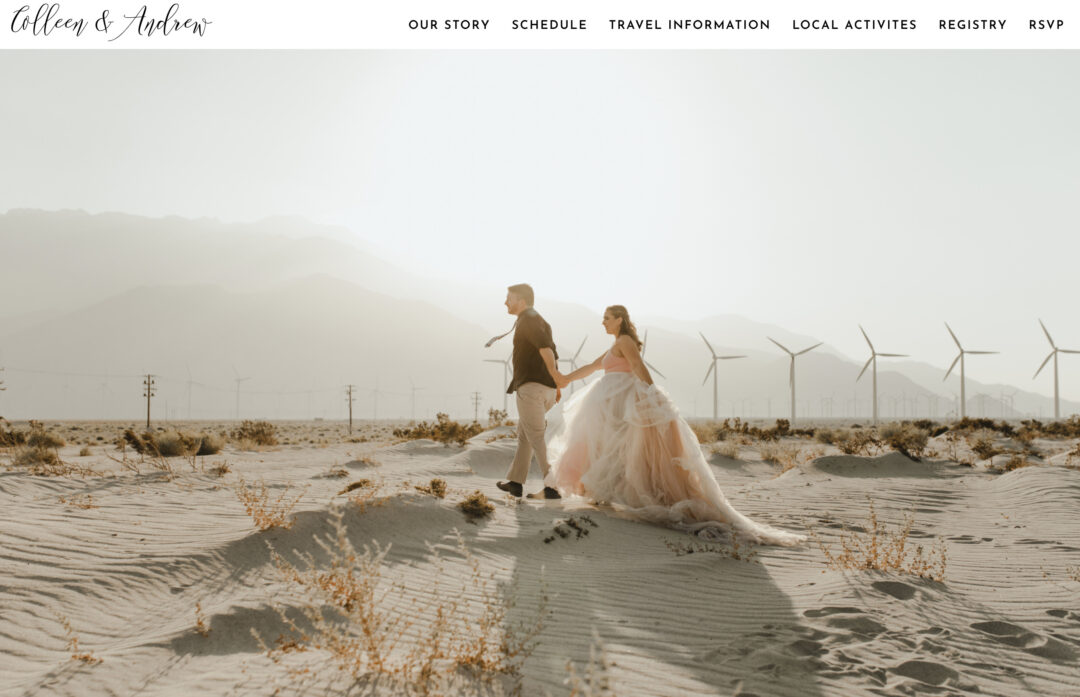
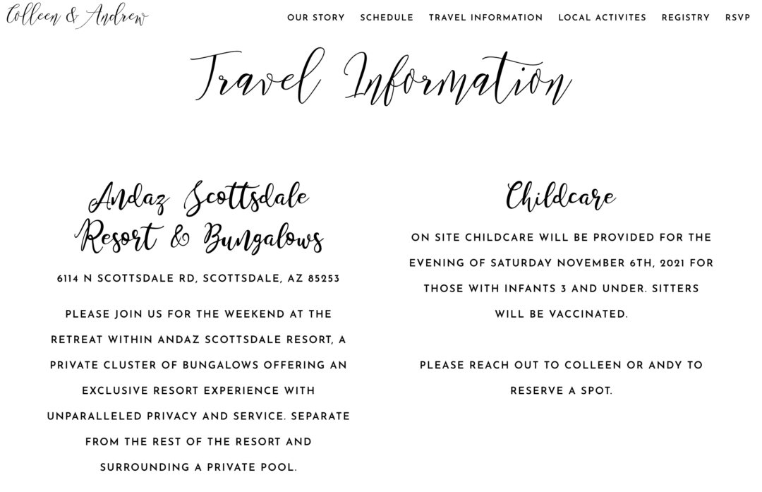
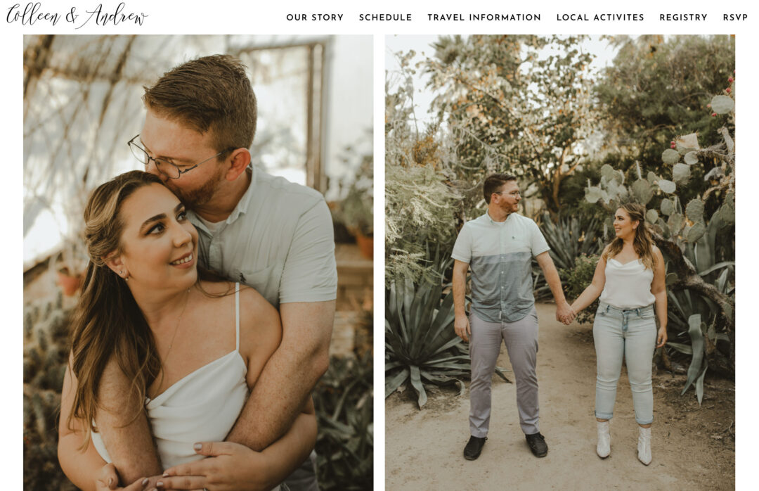
Why we love it: Colleen and Andrews wedding website is another great example of simple, minimal design done well. These two have chosen a clean white background with black text, and high-quality images to add a splash of colour.
We love that they’ve personalised their wedding website by including the story of how they met and their proposal. And for guests travelling out of town, Colleen and Andrew have included some super helpful details surrounding childcare, transport and a list of local activities they recommend.
11. Nikolina and Oliver
Template used: Byron

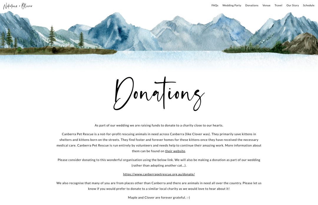
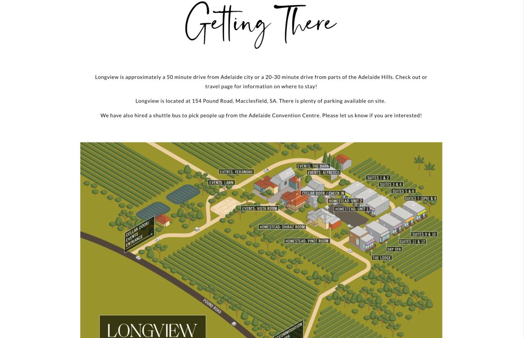
Why we love it: Nikolina and Oliver created their own custom watercolor illustration to suit their outdoor wedding celebration. We love how the water color blends into the white crisp background and their use of customer calligraphy headers for each of their pages.
Rather than opting for a registry, this couple decided to raise funds to donate to the Canberra Pet Rescue, a charity close to their hearts where they adopted their own little fur baby!
12. Laura and David
Template used: Melbourne
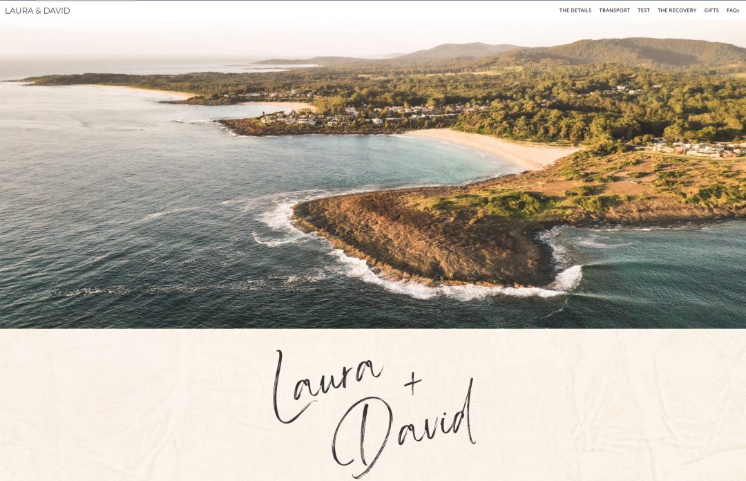
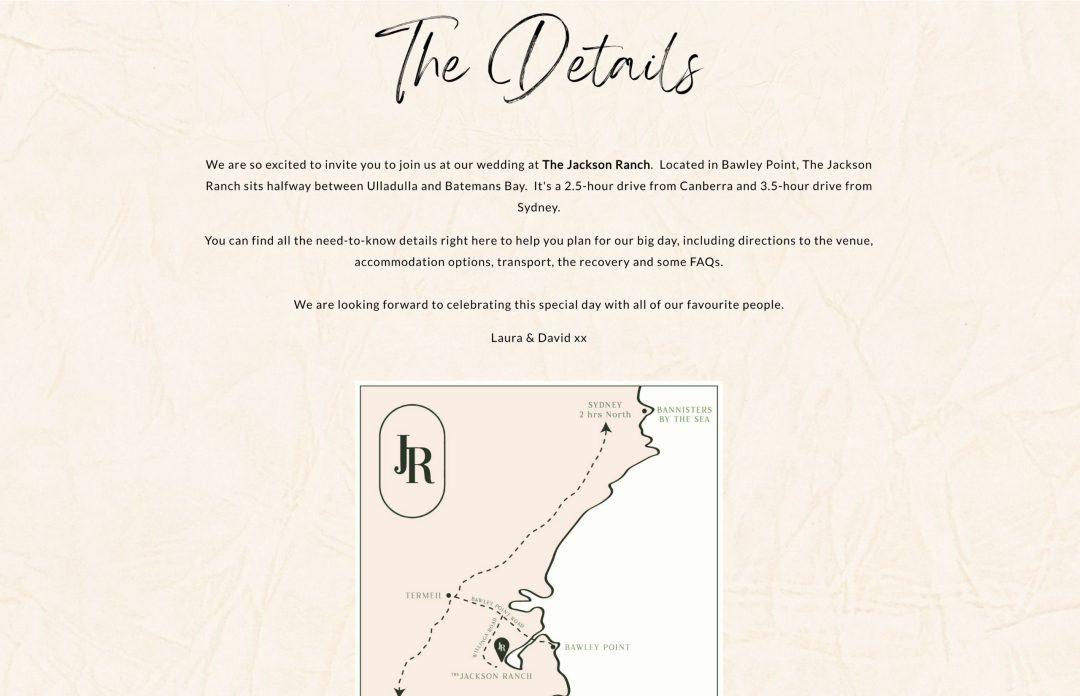
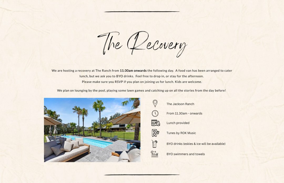
Why we love it: Laura and David set the tone of their wedding website with a beautiful landscape photo of their wedding destination in Bawley Point, NSW. We love their choice of custom calligraphy headers throughout the pages of their website and thoughtful maps to help guests find their wedding venue.
We definitely took notice of their Recovery Breakfast section and their use of these fun icons to showoff the chill vibes guests can expect after the big day!
13. Nhi and Andrew
Template used: Dauphin
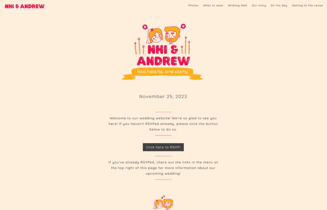
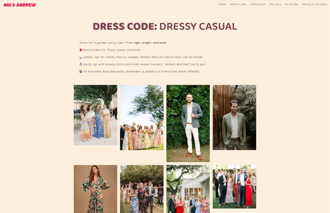
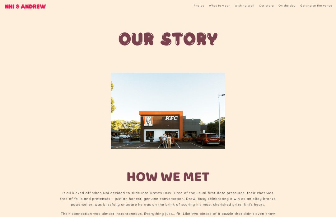
Why we love it: Nhi and Andrew look like the cutest couple! We absolutely love the cartoon illustration of themselves and their playful font selection. The photos they’ve used throughout their wedding website really make their personalities shine through – they seem like such a fun couple to hang out with!
Their “What to Wear” page really stood out to us with helpful tips and examples of their dress code to help their guests find the perfect outfit to wear.
14. Kaitlyn and Eric
Template used: Dauphin
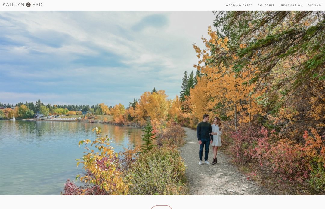
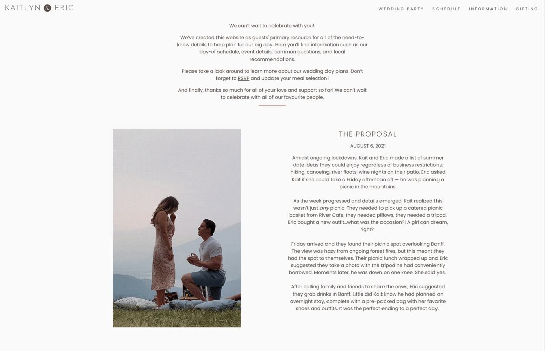
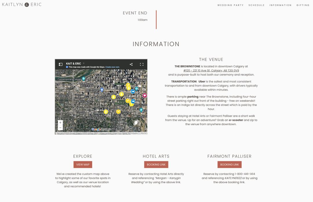
Why we love it: We love an eye catching header image! The autumn colors in Kaitlyn and Eric’s photo set the color scheme for their entire website. We love their custom wedding logo using their initials and especially the perfect GIF of Eric proposing to Kaitlyn. That’s some excellent planning on his part – huge props to him!
The couple put together a thoughful Google Map with their recommended restaurants, hotels, pubs, and the wedding venue so guests can easily click through and find their way.
15. David and Emily
Template used: Dauphin
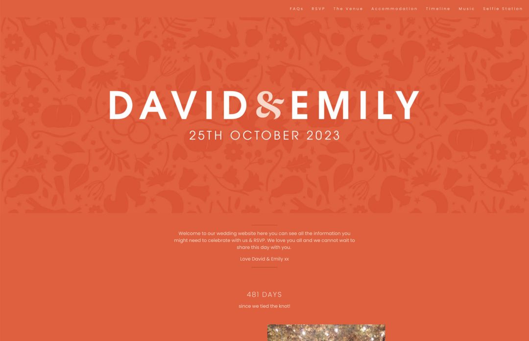
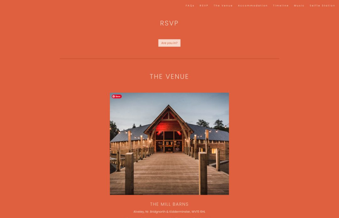
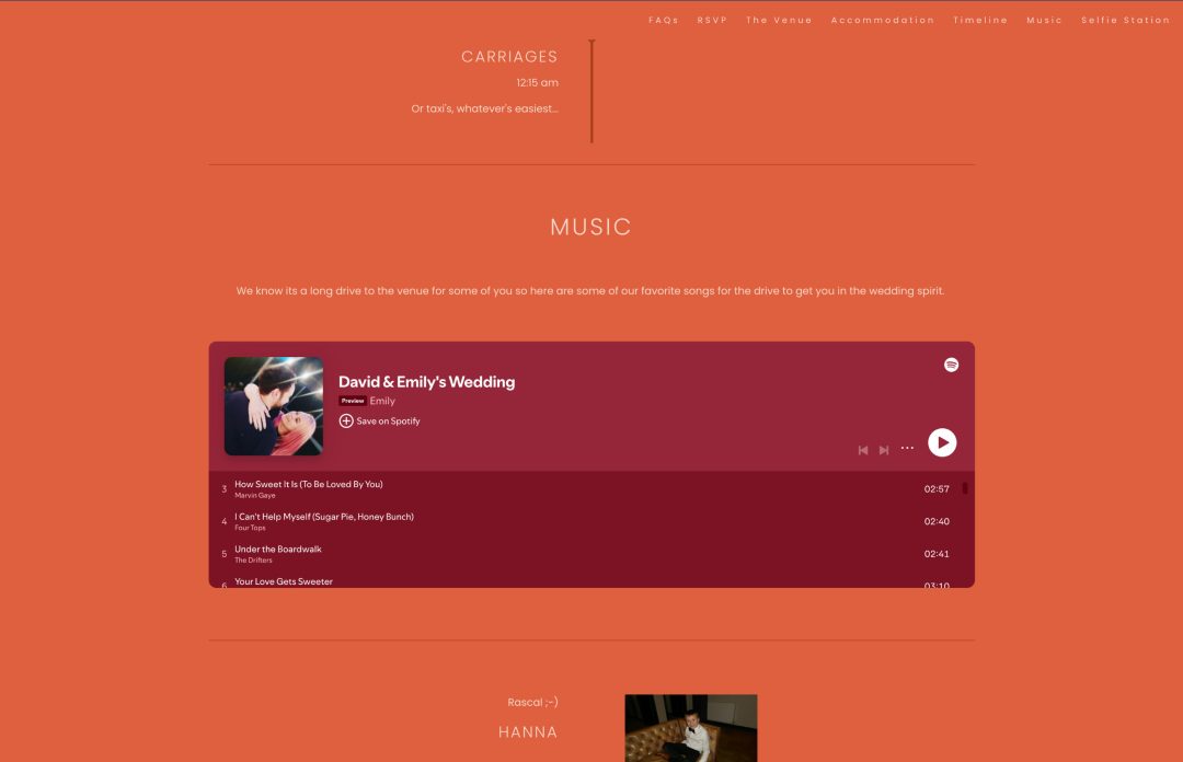
Why we love it: David and Emily created a custom header image with a subtle autumn forest pattern set behind their names. Did you catch the hidden wedding rings in the pattern?
We love that they created a special Spotify playlist for guests to listen to for the long drive to the venue to help them get into the wedding spirit!
15. George and Tarini
Template used: Denver

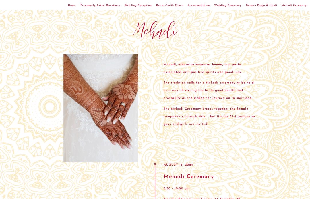
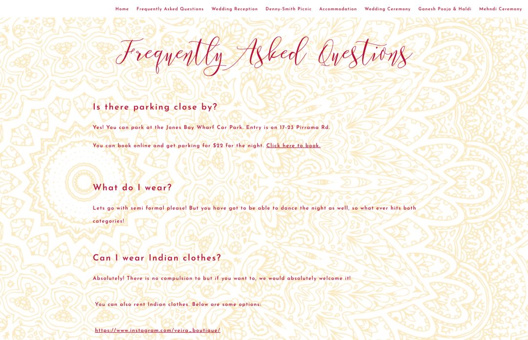
Why we love it: George and Tarini had a multicultural wedding with different cultural events spanning across several days. Indian weddings notoriously have a large guest list, and with guests most likely flying in from overseas, we think it’s really smart that the couple created a separate page for each of their events.
We love that the Bride explains what a Ganesha Puja, Haldi, and Mehndi ceremony is and what to expect. I’m sure the Groom’s side of the family and friends really appreciated this extra tidbit of information to help them feel more prepared! We’re all for the wedding website doing the talking on your behalf, so this is a really great way to pre-emtively answer questions from guests who wouldn’t be familiar with these traditional events.
15. Amanda and Tim
Template used: Sofia
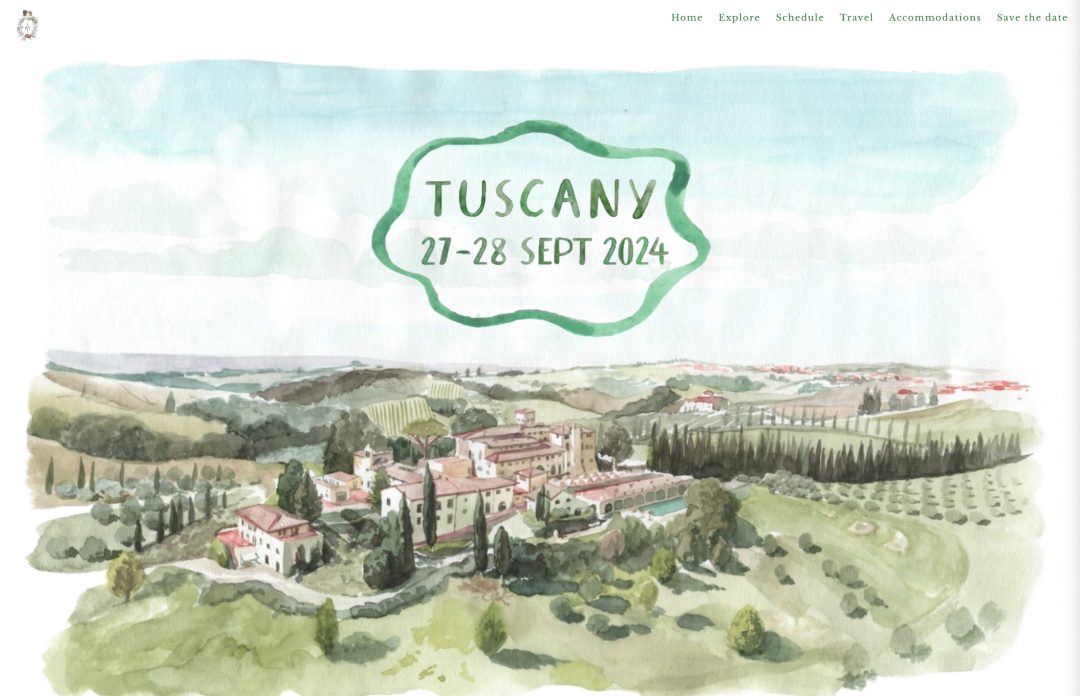
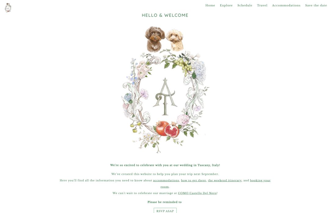
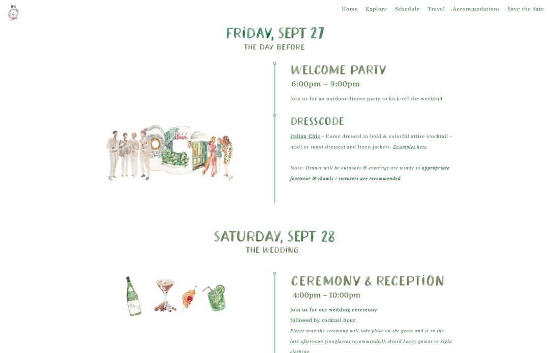
Why we love it: We were completely blown away by the beautiful watercolor illustrations Amanda and Tim used for their wedding website. They’ve put so much work into designing the perfect site packed with helpful information to guide guests to their destination wedding in Tuscany, Italy.
Not only was Amanda and Tim’s website was adorned with beautiful watercolor illustrations, but they even used a watercolor typeface for all the headers they used throughout the site. Loved that they stayed on brand and kept a coheasive look across all the different pages.
16. Bianca and Dallas
Template used: Byron
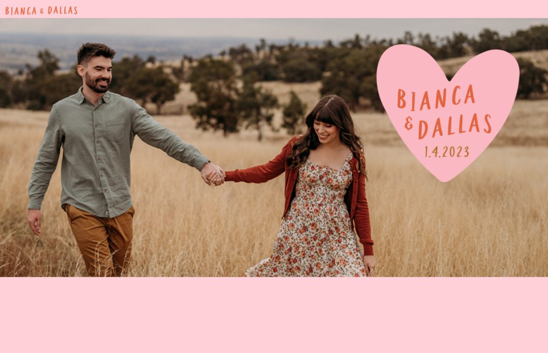
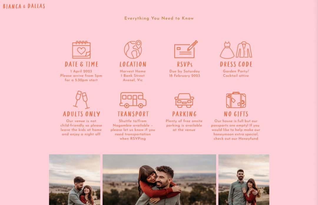
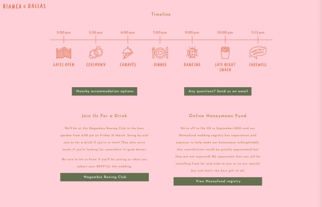
Why we love it: Biana and Dallas designed a single scroll website with all the necessary info. We love how they’ve used line icons to illustrate pertinent information in their “Everything you need to know” section and event timeline, keeping it tight and easy to read.
17. Nicholas and Caitlin
Template used: Dauphin
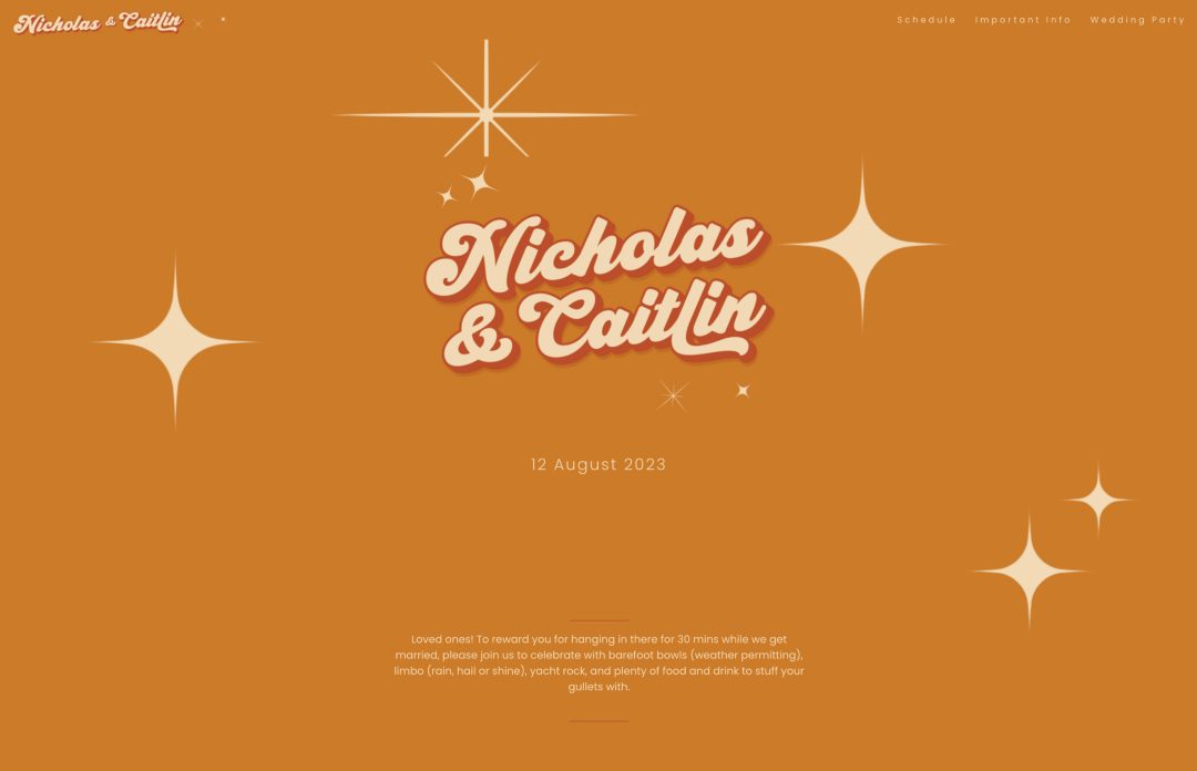
Why we love it: Nicholas and Caitlin also created a single scroll website with just the right amount of information to help guests prepare for their big day. We love the custom header logo they used and overlayed it ontop of a fun retro 70’s esque background image.
It’s always nice to show some love to your wedding party by giving them a special shoutout on your wedding website. Caitlin totally nailed this part!
18. Naomi and Grant
Template used: Constanta
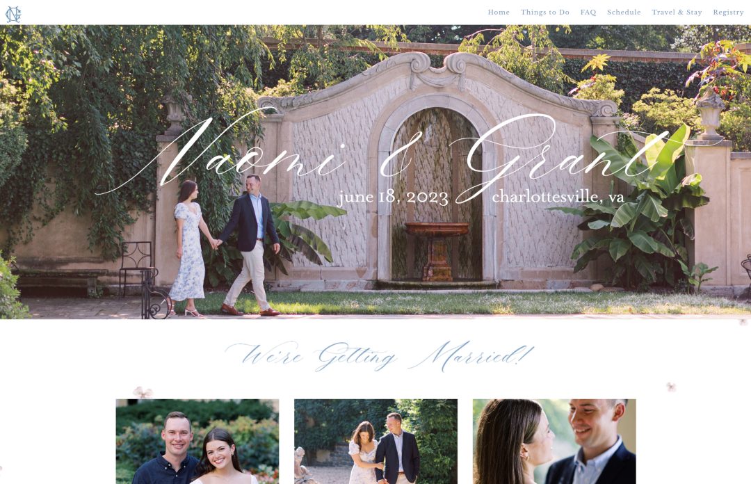
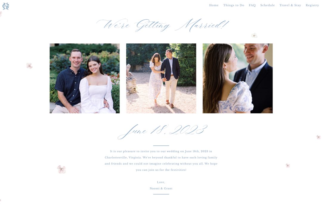
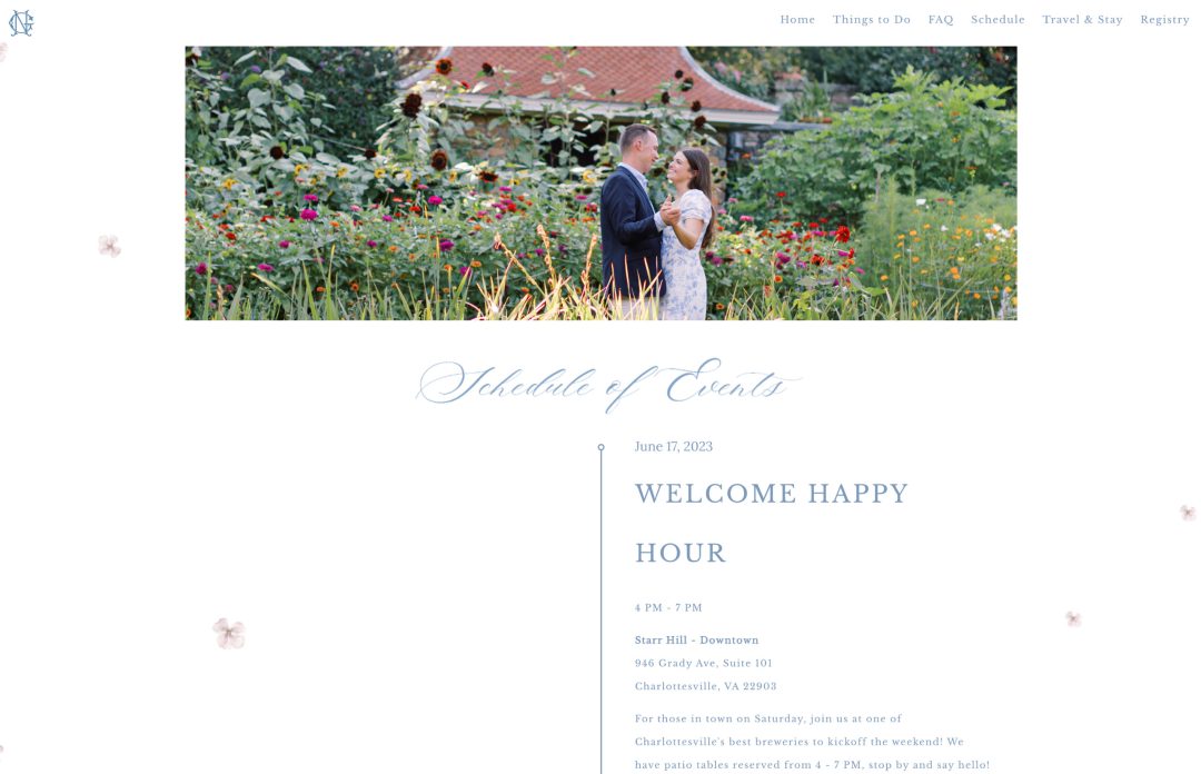
Why we love it: What is it about Naomi and Grant’s website that just looks so perfect? Everything from their engagement photoshoot, outifts, fonts and color choices match their stunning venue. We could not have selected a better combination here!
This wedding website example just exudes elegance and classic charm. We loved that they’ve tastefully placed their engagements photos throughout the different pages of their website and used a very subtle floral background image to support the content. The custom emblem that they’ve created and used in their navigation menu is a total win too – I trust they used it for their on the day stationery as well!
19. Ansbert and Naa-Nerteley
Template used: Denver
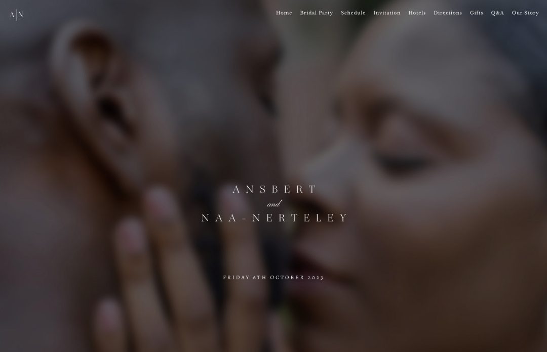
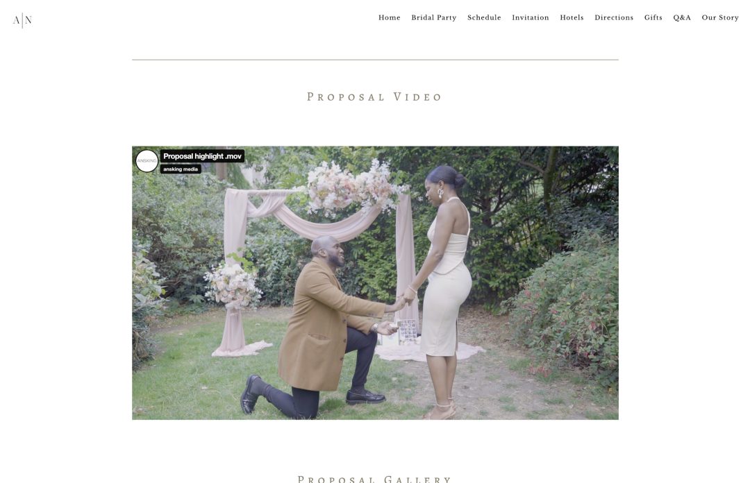
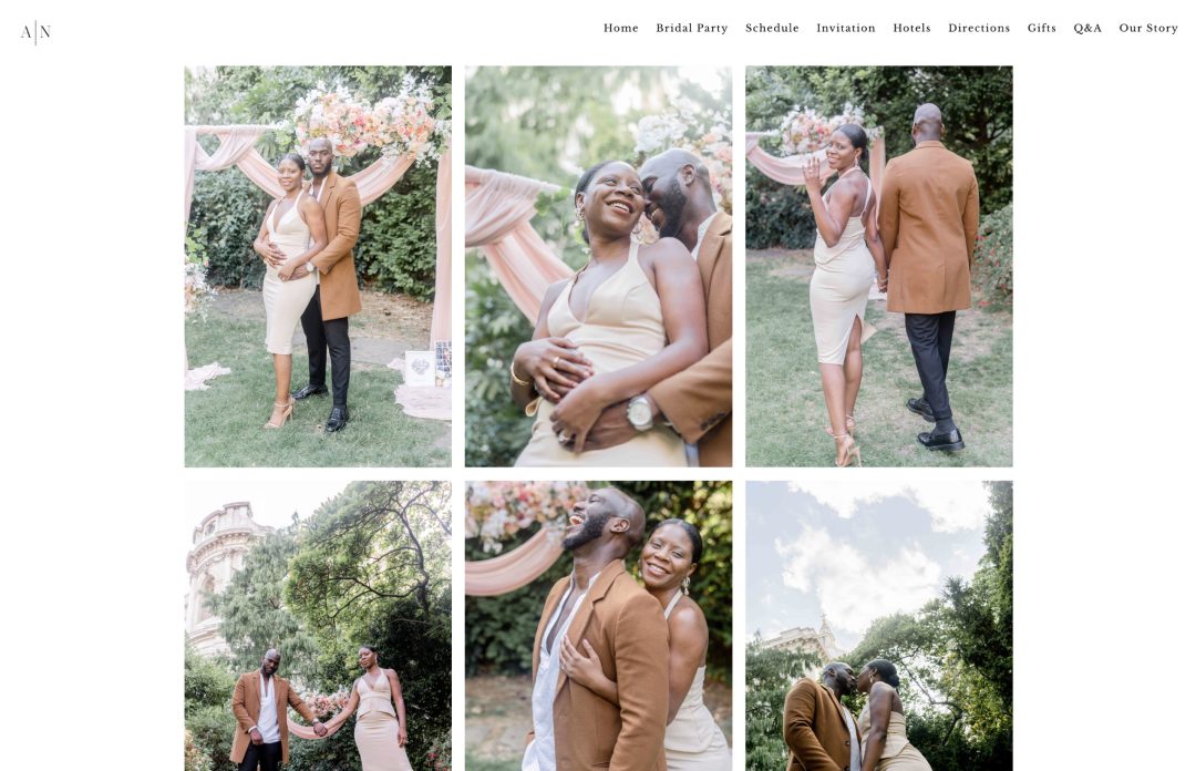
Why we love it: Ansbert and Naa-Nerteley’s wedding website certainly makes a great first impression! We love the header image that they’ve created that takes up the entire screen above the fold. They’ve overlayed their names ontop of a beautiful blurred photo from their proposal shoot – so romantic!
A special shoutout to Ansbert for capturing his proposal to Naa-Nerteley on film and sharing it on their wedding website, too!
20. Jess and Leroy
Template used: Denver
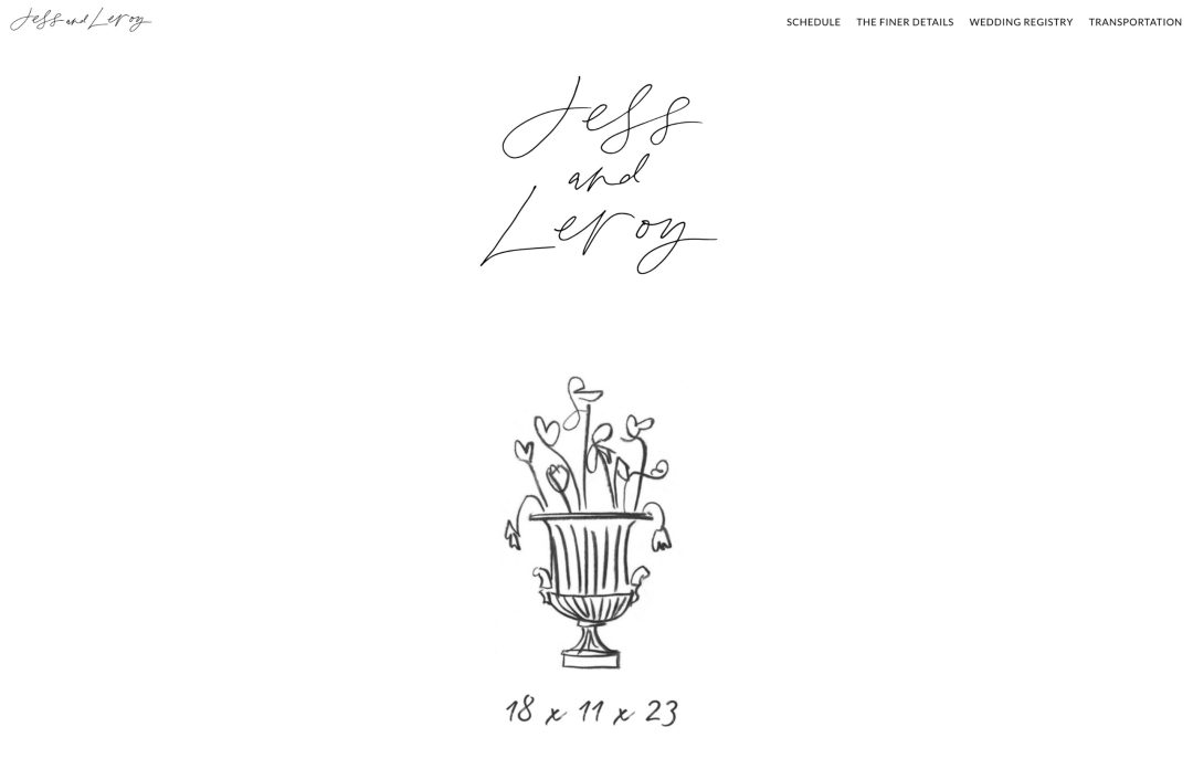
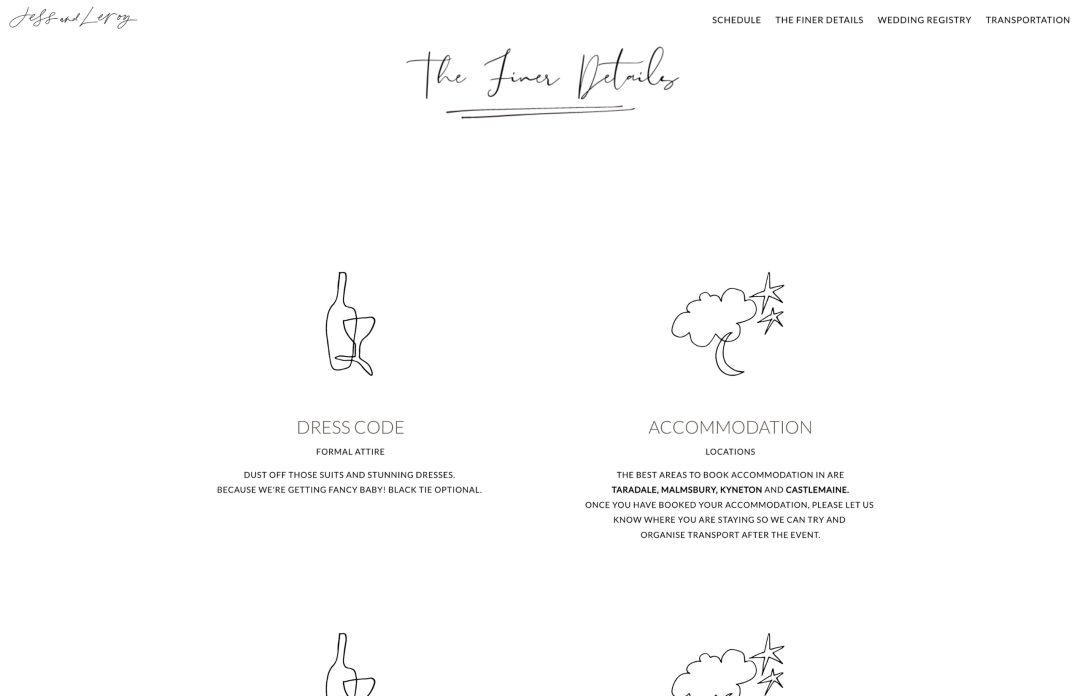
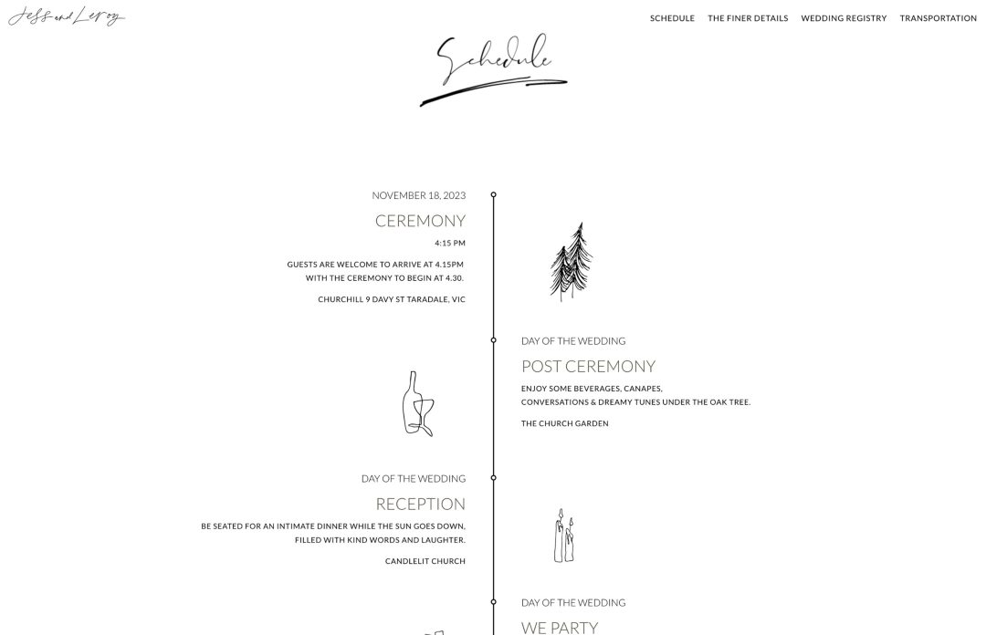
Why we love it: We love this minimalist wedding website that Jess and Leroy designed. Their handlettered names used in their header and navigation menu is so elegant, and we love how they’ve used this same style for their section headers and illustrations throughout the website.
21. Karel and Carlo
Template used: Dauphin
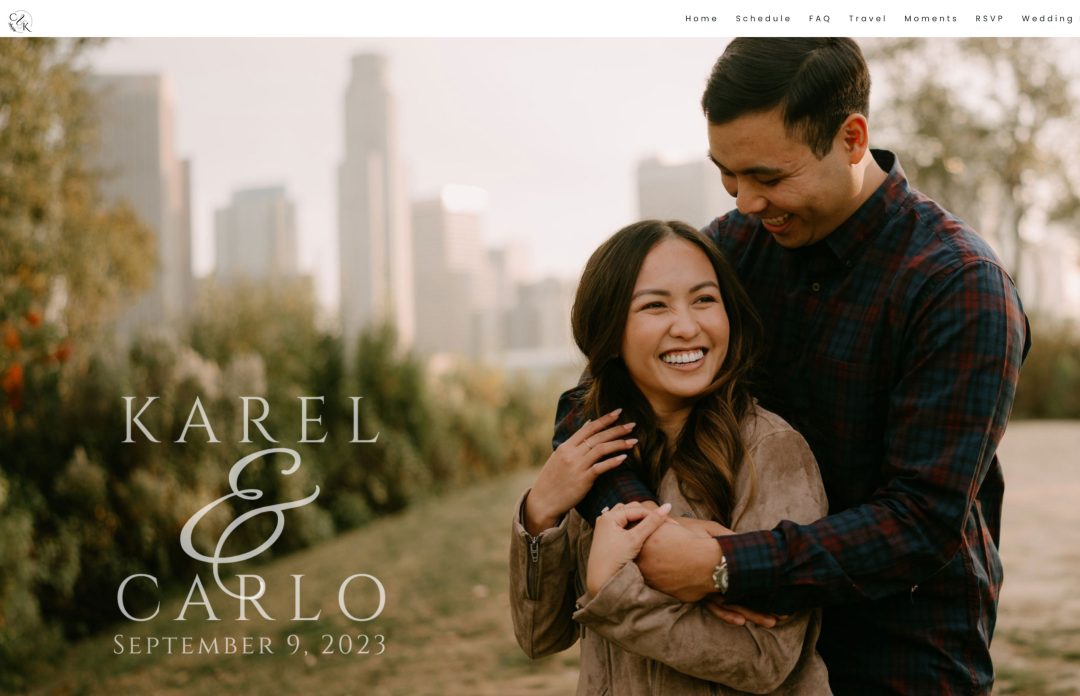
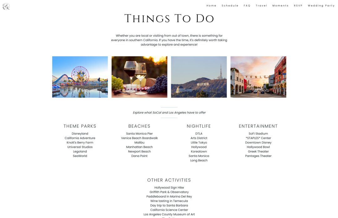
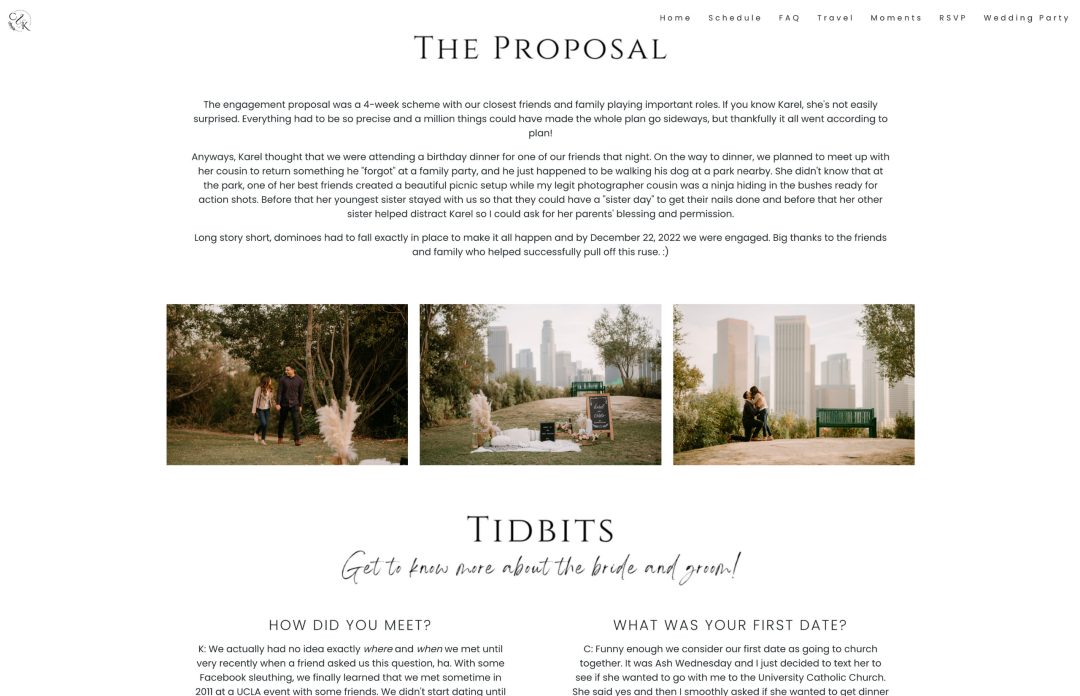
Why we love it: We love when couples plan a secret wedding proposal shoot and use those photograph for their wedding websites. We can’t say whether Karel and Carlo planned for this, but they certainly didn’t let their proposal photos go unseen.
We loved their Tidbits section to help guests get to know the bride and groom more with a fun little Q and A. So clever!
22. Ross & Hannah
Template used: Dauphin


Why we love it: We love the fun vibe of Ross and Hannah’s website! From the colors they chose to the playful confetti, and of course, their custom self portraits. This is definitely a one of a kind that can’t be replicated!
23. Oscar and Loyola
Template used: Denver


Why we love it: As a bicultural family ourselves, we’ve got a special place in our heart for multicultural weddings! Oscar and Loyola created this lovely header image featuring them and a blend of East and West design elements.
We love that they shared photos from their Tea Ceremony since this is usually an intimate event with just immediate family.
24. Martina and Ismail
Template used: Denver


Why we love it: Martina and Ismail threw an epic winter wedding weekend in the snowy mountains of Austria! We love how much information the couple packed into the website to ensure their guests could confidently make their way to the wedding venue. Destination weddings have their own set of challenges so we know their guests would have appreciated having this great resource at their finger tips!
We loved their “Explore the Area” section of their website with all the fun activities to do in the area. The illustrated map of the town with icons for the wedding venue, lunch the following day, and transporation to get there on each of the days was also a very thoughtful touch.
Not only did Martina and Ismail created an awesome website, but it’s definitely worth mentioning that they translated the entire site into 3 languages for their English, German, and Turkish speaking guests! A truly multilingual wedding website example on this list.
25. Lauren and Michael
Template used: Denver


Why we love it: We love the elegance and simplicity of Lauren and Michael’s wedding website! Their custom header emblem makes a beautiful statement on landing. This is a great example of a minimalist wedding website, we love their use of white space and careful selection of colors.
26. Julia and Tommy
Template used: Wailea


Why we love it: Julia and Tommy’s nautical wedding in Sweden definitely earned its place on this list! we love how their fascination with lighthouses inspired the fun illustration they designed for their header graphic. The custom compass icon in the navigation bar is also completely on theme with their design!
Dress code is something a lot of guests struggle with, so we have that the couple has spent time elaborating on what to expect on a Swedish summer day!
26. Angela and Daniel
Template used: Wailea


Why we love it: Angela and Daniel’s Italian destination wedding website caught our eye with this stunning GIF of the Amalfi coastline! The muted tones throughout their website, hand-lettered calligraphy details, and subtle lemon illustration set the vibe for their Italian summer event.
We love that they’ve included an “Escape to Italy Whilst We’re Counting Down” playlist to get their guests in the mood – such a fun idea!
27. Alicia and Dominic
Template used: Wailea


Why we love it: We loved the way Alicia and Dominic laid out their wedding information across different pages. For guests who have never been to Phoenix, Arizona, they created an entire Visit Guide with their recommended sights and a His and Her Go-To’s for the best eats in town!
For guests who couldn’t physically attend the wedding, they added a Live Stream so they could still tune in and feel included. We also couldn’t help but point out that the couple added a link to their digital save-the-date – we love this!
27. Anna and Scott
Template used: Byron


Why we love it: Anna and Scott did an excellent job reflecting their wedding theme throughout their website. We love their color choices, background image, and the bohemian illustrations used throughout their site.
Their “Vibes” section really sets the tone and paints a picture of what guests could expect on the day, a chilled out Rustic Bohemian vibe with a nod to the Western spirit – we love that!
What Makes a Great Wedding Website?
As you can see in the wedding website examples above, there are so many ways to create a memorable visual experience for you and your loved ones. Here are our top tips to keep in mind when designing your wedding website:
1. Make it personal
Add a personal touch to your wedding website by including custom details like illustrations, images from your relationship, or the story of how you met. If you’re using traditional wedding invitations, why not work with your calligrapher to create a custom motif that can be used across all design elements?
2. Keep it practical
Help your guests prepare for your wedding by including as much information as possible. Think: venue directions, dress code, registry links, and FAQs.
Read our guide on what to include on your wedding website here!
3. Make it easy to RSVP
If you’ve opted for online RSVPs, make sure your RSVP button is immediately visible to your guests. The easier it is to RSVP, the quicker you’ll get those responses back!
4. Set the tone for your celebration
Give your guests a glimpse of what to expect on the day by sharing a schedule of events, introducing your bridal party, or even putting together a playlist of your favorite tunes to get the good vibes flowing!
Popular Wedding Website Design Trends in 2025
We’ve covered what makes a practical wedding website and pointed out what we love about the wedding website examples in this article, but let’s touch on design trends. Long are the days when couples are choosing a cookie-cutter template and calling it a day. Modern couples are much more design-conscious and savvy when it comes to creating a wedding website that reflects who they are as a couple and what they have in store for guests.
Minimalism
A focus on simplicity with plenty of negative space around each element on the page. This design trend is all about letting the essential information stand out and nothing else. Think clean fonts, muted color schemes, and straightforward navigation to ensure wedding guests can easily find what they’re looking for.
Interactive elements
Wedding websites should be set up to be your first line of concierge service for your guests. Of course, laying out the most important information for them to easily find is important, but having interactive elements is a fun way for guests to engage with your website. Consider adding a wedding countdown and, guestbook for guests to leave a message. Most importantly, make sure you’ve set up an RSVP process so guests can let you know if they can attend.
Personalized illustrations
This one takes the cake when it comes to creating a bespoke wedding website. Custom drawings or artwork that reflect the couple’s personality, theme, or love story. As you’ve seen in some of the wedding website examples above, this trend really gives the website a personal, unique touch that won’t be seen anywhere else.
Bold typography
Choosing playful, elegant, or modern fonts can really convey the couple’s personal style and help set the tone for the wedding day. A design trend we’re seeing a lot of modern couples use for their wedding websites is bold typography in combination with minimalism. You really can’t go wrong with this!
Let’s Start Building Your Wedding Website
Feeling inspired by these couples to create your wedding website? Check out our full showcase to see even more real wedding website examples.
All of the wedding website examples above were created using the WedSites wedding website builder. Get started by creating a free account and designing the perfect wedding website for your big day!