Wedding websites have come a long way from a simple page with your date, venue, and RSVP details. These days, they can be a little preview of your wedding itself – from romantic, whimsical designs to bold colors, playful illustrations, and editorial-style layouts.
Whether you’re planning a classic black-tie affair, a colorful backyard celebration, or a destination wedding with a full weekend of events, there’s plenty of room to make your website feel like you.
With that said, we’ve rounded up some of our favorite wedding website examples for 2026 to give you ideas, spark a little creativity, and help you figure out what you want your own website to look and feel like. Along the way, we’ll highlight the little design details worth borrowing, plus the practical touches that make life easier for your guests.
Let’s get inspired!
Romantic / Whimsical Wedding Website Examples
Sandra + Joel
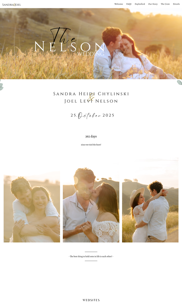
Why it works: Sandra and Joel’s wedding website feels romantic without going over the top. Golden-hour photos, sage-green botanical details, elegant serif fonts, and flowing script all work together to create a look that’s soft, natural, and beautifully cohesive.
It’s the personal touches that make it extra special, though. Alongside their love story and wedding party introductions, they’ve even included profiles of their pets! A handy FAQ page also covers the practical stuff, from transport and accommodation to attire and dietary requirements.
Design idea to borrow: Love a natural, romantic look? Try pairing a soft color palette with complementary fonts and photos that capture your relationship. A few personal details can make a familiar design feel completely your own.
Hayley + Jake
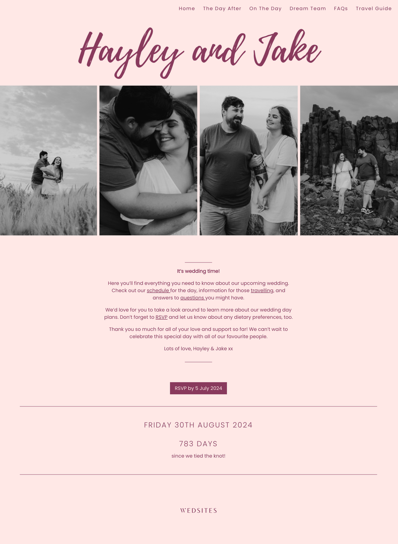
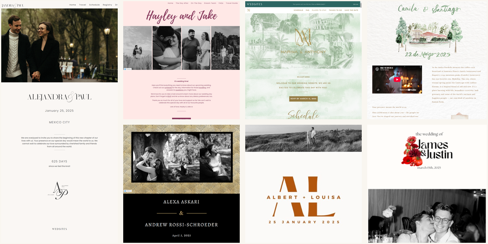
Why it works: If you’re drawn to a softer color palette but still want your website to have a little personality, Hayley and Jake’s design is worth a look. The blush pink background, berry-colored lettering, and oversized script create a romantic feel, while black-and-white photos add contrast and keep the layout from feeling too sweet.
The design has a recognizable style, but the important information still has room to breathe. We also love how they’ve equipped their guests with helpful FAQs and a travel guide to make the most of their stay.
Design idea to borrow: Choose one signature color and carry it through your headings, buttons, and smaller design details. You don’t need to use it everywhere – a few thoughtful touches can tie the whole website together.
Minimalist / Editorial Wedding Website Examples
Alejandra + Paul
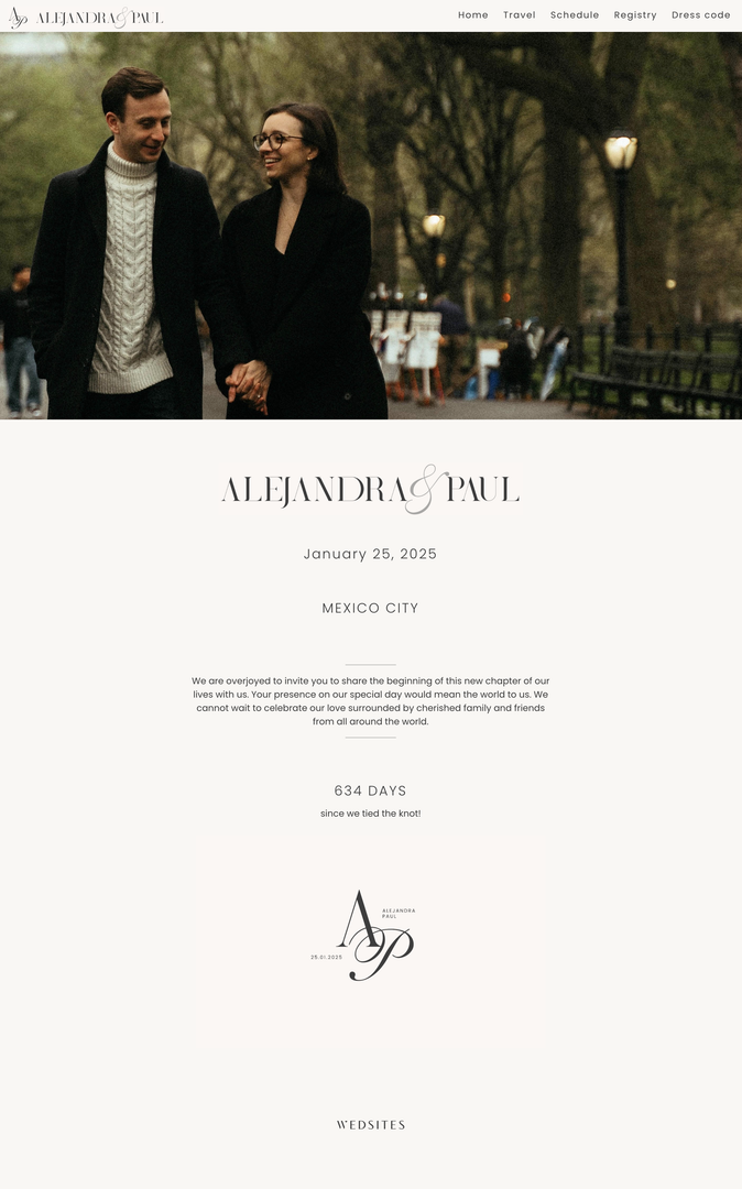
Why it works: Alejandra and Paul’s wedding website embraces understated elegance, with a neutral color palette, refined typography, and a striking hero photograph of the couple. A custom monogram and generous white space also give the design a polished, editorial feel.
The homepage keeps things simple, with the wedding date, location, a personal welcome message, and a countdown displayed prominently. A minimal navigation menu also directs guests to key sections, including travel, the schedule, the registry, and dress code.
Design idea to borrow: Let your photography and typography do the talking! A neutral palette, generous white space, and a custom monogram can create a luxurious feel without needing lots of extra design elements.
Louisa + Albert
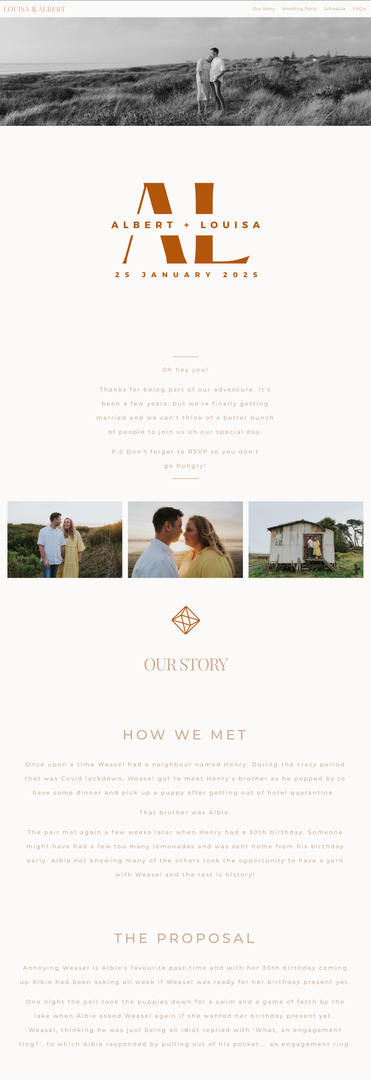
Why it works: Albert and Louisa’s wedding website pairs black-and-white photography with warm terracotta accents, minimalist typography, and a geometric monogram. The white space and restrained design give it a modern, understated feel, while the orange details add personality without overwhelming the page.
The site balances its clean aesthetic with personal touches, including a sweet “how we met” story, wedding party introductions, and a timeline of the celebrations.
Design idea to borrow: Pick one accent color to bring a neutral design to life. You could use it for headings, dividers, buttons, or small graphic details.
Destination / Travel Inspired Wedding Website Examples
Marina + Anthony
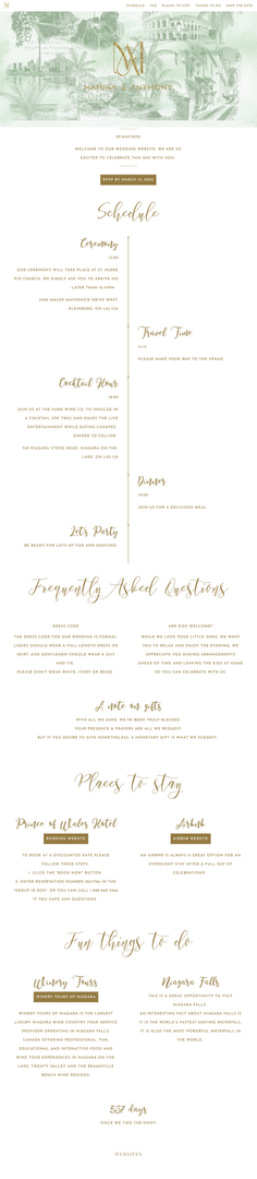
Why it works: Marina and Anthony’s destination wedding website immediately transports their guests, with a stunning illustrated collage of local landmarks! Paired with gold accents and flowing script typography, their design details create a sense of place before guests even start reading.
The website also includes a weekend timeline, accommodation information, local activities, and an FAQ to help guests plan their trip. Instead of hunting through messages for hotel recommendations or event times, they have one place to check everything.
Design idea to borrow: If you’re getting married somewhere special, consider incorporating an illustration of the venue or a recognizable local landmark. Pair it with a practical travel section covering where to stay, how to get around, and what guests can do while they’re there.
Camila + Santiago
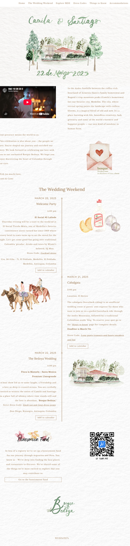
Why it works: Camila and Santiago’s wedding website combines watercolor-style venue illustrations, soft green lettering, delicate botanical details, and warm neutral tones. The mix of artwork, photography, and video adds visual interest while keeping the information organized.
The website also helps guests experience the celebrations beyond the wedding day, with a detailed multi-day schedule, local recommendations, dress codes, and a honeymoon fund.
Design idea to borrow: Add a personal touch and embed your proposal video into your website design!
Black Tie / Formal Wedding Website Examples
Alexa + Andrew

Why it works: Alexa and Andrew’s wedding website makes a statement with a dramatic black-and-gold palette and refined serif typography. A textured gold header adds visual interest, while a custom monogram repeated throughout the site gives the design a cohesive, bespoke feel.
The elegant styling is paired with practical details, including a timeline for the full wedding weekend, hotel recommendations, and a registry link. Gold accents highlight key buttons and section dividers, helping important information stand out against the dark background.
Design idea to borrow: Choose two or three signature colors and repeat them across your website, from headings and buttons to custom monograms. A consistent visual identity can make even practical sections feel polished.
Laura + Kyle
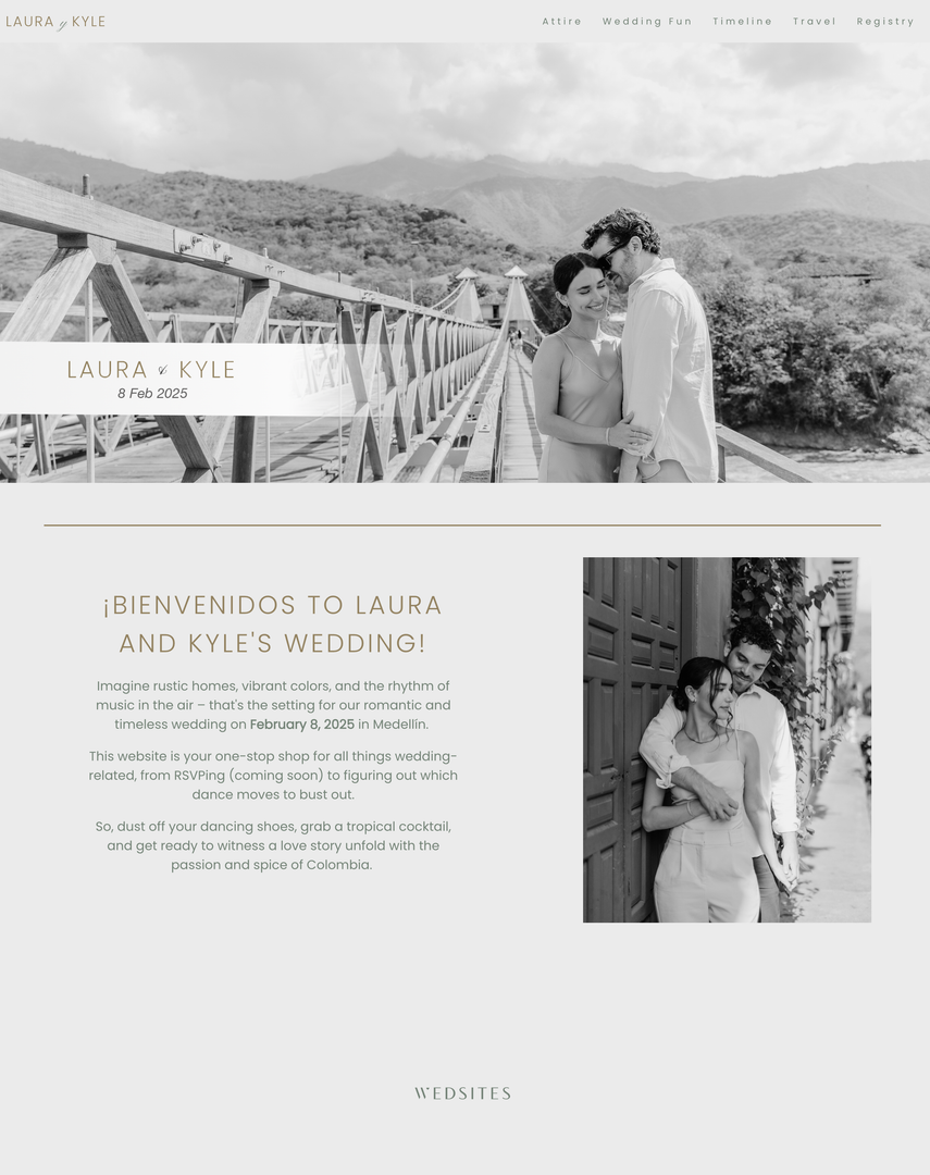
Why it works: Laura and Kyle’s website takes a softer approach to formal design. Black-and-white photography is paired with sage-green text, gold accents, and a spacious layout that feels elegant without being overly traditional.
We love how interactive this wedding website is! Alongside travel information and the event timeline, the website includes a collaborative playlist, local food recommendations, a WhatsApp group, and even a scavenger hunt! It’s a good reminder that a formal celebration can still have playful, personal touches.
Design idea to borrow: Keep the main design polished, then add one or two features that reflect your personalities. A shared playlist, local recommendations, or a fun activity can give guests something to look forward to beyond the ceremony itself.
Bold / Colorful Wedding Website Examples
James + Justin

Why it works: James and Justin’s wedding website puts a playful spin on modern editorial design, pairing oversized headings with bright red floral and chilli illustrations against a warm, neutral background.
Black-and-white photography adds contrast, while recurring cherry and pepper motifs tie the different sections together. The result feels bold, personal, and full of character!
Design idea to borrow: Choose a distinctive motif that reflects your personality, then repeat it throughout your website. Unexpected illustrations, expressive typography, and playful section headings can make a design feel memorable and uniquely yours.
Max + Sophie

Why it works: Max and Soph’s website leans into a playful, retro-inspired aesthetic. Terracotta tones, vintage-style typography, a custom illustrated hero image, and hand-drawn icons give the site plenty of personality.
A custom map illustration carries the visual style into the practical details, helping guests navigate the celebration without breaking the overall design.
Design idea to borrow: Build your website around a distinctive illustration style, then carry it through your schedule, map, and smaller decorative details. A strong visual theme can make practical information feel like part of your wedding story!
Elizabeth + Zygimantas
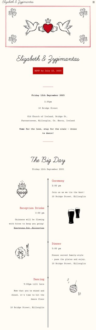
Why it works: Elizabeth and Zygimantas’ website has a charming vintage feel, with an ivory background, hand-drawn illustrations, fine red accents, and expressive script typography. The artwork includes details like a crowned heart, champagne, beer mugs, and a disco ball – giving little hints of the celebration and the couple’s personalities!
The illustrations give the website a distinctive look, while the limited color palette keeps everything from feeling too busy. The practical information also has a clear place, so guests can enjoy the design without having to search for the details they need.
Design idea to borrow: You don’t need to illustrate every section to create a memorable website. Choose a few meaningful symbols, and repeat the artwork where it makes sense. The result can feel personal without becoming cluttered.
Before and After: How to Transform a Wedding Website Template
You don’t need to start with a blank page to create a wedding website that feels uniquely yours. With our fully customizable templates, you can change the colors, fonts, photos, and layout to match your wedding style.
Here’s how couples can take one of our starting designs and make it their own!
Starting template: Ella – Melbourne
Sandra and Joel’s finished design shows how a template can become more personal with hero photography, elegant typography, and thoughtful touches like their relationship story, pet profiles and “this or that” quizzes. The result feels cohesive and connected to their countryside wedding style.
What changed: The color palette, photography, typography, and personal content transformed the starting design into something that reflects the couple and their celebration.
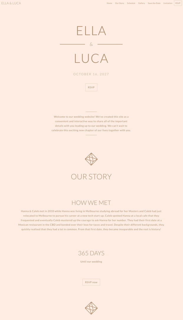
Before (left) and after (right)
Starting template: Asher – Byron
Max and Soph’s website takes a more creative approach, using a terracotta background, retro-inspired typography, custom illustrations, and a hand-drawn map. These choices give the design a distinctive personality while keeping practical guest information easy to find.
What changed: Bold colors, expressive typography, and custom illustrations turned the original template into a design with a strong visual identity.
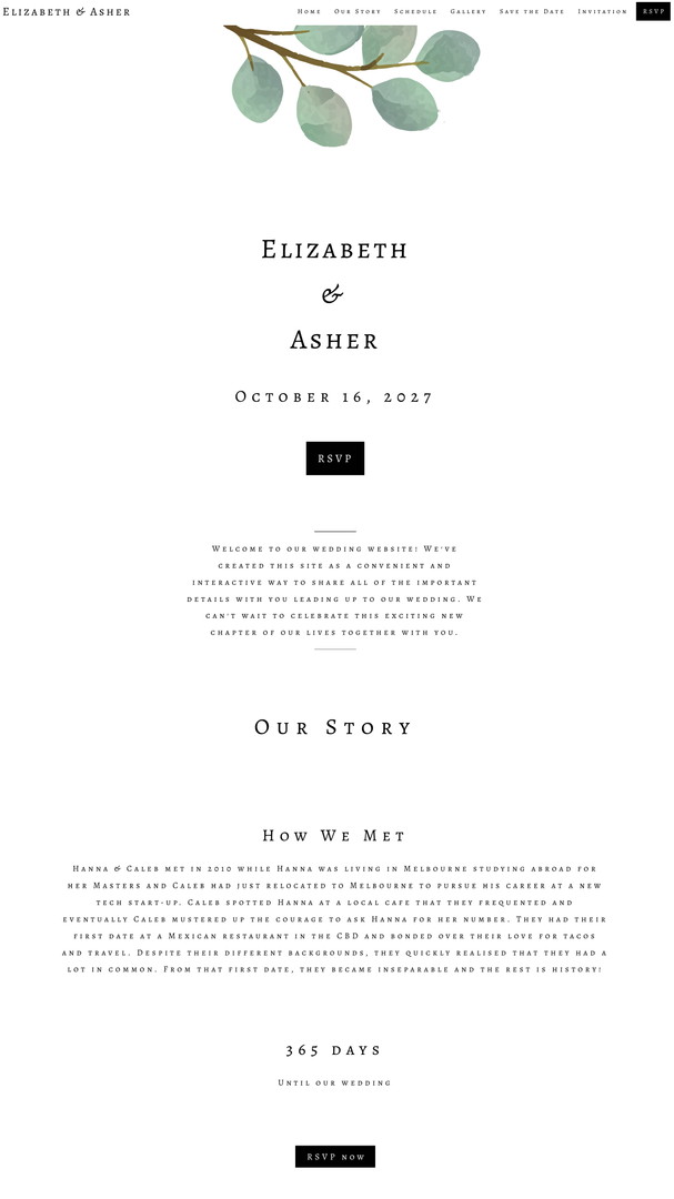
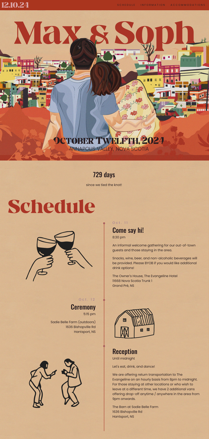
Before (left) and after (right)
Wedding Website Design Trends for 2026
Wedding websites are becoming more personal, creative, and connected to the overall wedding experience. From unique typography to interactive guest features, these design ideas can help you create a website that feels current – while still reflecting your own style.
1. Bold Colors and Unexpected Palettes
Who says wedding websites have to stick to blush pink and sage green? Bold tones like rich burgundy, butter yellow, terracotta, or cobalt blue can all make a statement.
Try using a favorite shade in your headings, buttons, or backgrounds to give your website a little personality without overwhelming the design. If you’re unsure where to start, take inspiration from your flowers, invitations, or wedding-day styling.
2. Editorial Typography
If you love that polished, magazine-inspired look, typography is a great place to start. Oversized names, elegant serif fonts, and expressive script can make your website feel instantly elevated.
Just keep your body text simple and readable so guests can still find the important details. A beautiful font is lovely, but not if your guests have to squint to work out when the ceremony starts!
3. Custom Illustrations and Personal Motifs
Want something that feels a little more personal? Hand-drawn venue illustrations, custom monograms, or a motif inspired by your relationship can give your website its own personality.
Carry those details across your pages or stationery for a look that ties everything together.
4. Immersive Photography and Video
Your website is often one of the first glimpses guests get of your wedding style, so photography can do a lot of the work. A statement hero image, a collage of candid photos, or a short video can help set the mood before guests read a single word.
Choose images that feel like you rather than simply filling every space. And if you add video or animation, keep it lightweight and make sure the essential information is still easy to read and navigate.
5. Interactive Features
A wedding website can be more than a place to share information. Interactive features like collaborative playlists, online guestbooks or even shared WhatsApp groups can help guests feel more involved before the big day!
Tips for Customizing Your Wedding Website
Found a design you love? A few thoughtful choices can help you turn that inspiration into a wedding website that feels personal, looks cohesive, and gives your guests everything they need.
- Bring your wedding style into the design: Use your colors, fonts, and stationery as a starting point. You don’t need to match every detail perfectly, but a few consistent choices will help everything feel connected.
- Check it on your phone: Make sure the text is readable, navigation is simple, and guests can find key details without endless scrolling. Your website should work just as well on a small screen as it does on a laptop.
- Make RSVPs easy: Keep your RSVP button easy to spot – it should be immediately visible from the homepage. If you’re hosting several events, make sure guests know which ones apply to them (a wedding website with guest-specific visibility can be handy for this).
- Keep the practical stuff organized: Give your schedule, travel details, accommodation recommendations, dress code, and FAQs their own sections or pages. Guests should be able to find an answer quickly, especially when they’re on the go.
- Add personal touches: Think engagement photos, your love story, custom illustrations, or little details that feel very you. Even one or two thoughtful additions can make a template feel much more personal.
- Give everything a final check: Test your links and RSVP form, double-check dates and addresses, and preview the finished site on desktop and mobile before sharing it with guests.
Wedding Website Design FAQs
Still have questions about creating your wedding website? Here are answers to some common questions about design, customization, and making your site guest-friendly.
At a minimum, include your wedding date, venue, schedule, RSVP details, and dress code. You can also add accommodation, travel information, FAQs, registry details, and your love story.
Yes! Many wedding website builders let you customize colors, fonts, photos, layouts, and other design details. The options vary by platform, so look for one that gives you the creative flexibility you want. We compare the most customizable wedding website builders here.
Use your wedding colors, invitation design, and overall aesthetic as inspiration. Repeating a few fonts, colors, or visual details can help your website feel connected to your celebration.
Absolutely! If you’re hosting a welcome party, ceremony, reception, or post-wedding brunch, use separate sections or pages to organize the details. Make sure guests can easily identify which events they’re invited to. Read our guide to organizing multiple events on your wedding website here.
Definitely. Many guests will view your website on their phones, so choose a design with readable text, simple navigation, and easy-to-find RSVP details. Always preview your website on mobile before sharing it.
Yes, depending on the wedding website builder you choose. Some platforms offer password protection or privacy settings to help you control who can view your wedding details. Check the available options if you’d prefer to share your website only with invited guests.
Create a Wedding Website That Feels Like You
The best wedding website is one that reflects your personality, builds excitement for your celebration, and makes it easy for guests to find everything they need. Whether you’re drawn to minimalist layouts, romantic details, or bold illustrations, use these examples as inspiration to create something that feels uniquely yours!
Ready to bring your ideas to life? Explore our customizable wedding website templates here at WedSites, or find even more inspiration in our wedding website showcase.