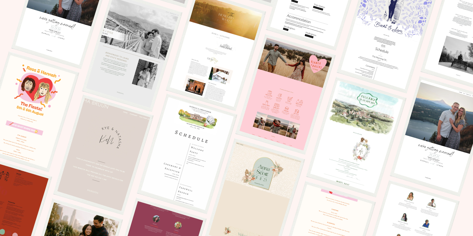
Looking for wedding website design inspiration? Whether your style is modern and minimal or romantic and boho, this roundup of real wedding website examples will help you find the perfect template for your big day.
Unlike other platforms, our wedding website builder here at WedSites gives you full creative control – so no two websites ever look the same! With our drag-and-drop templates, you can easily customize your site with fonts, colors, digital artworks and more.
From classic to colorful, scroll through these inspiring wedding website examples (organized by style) to find a design that reflects your unique wedding vision below.
How to Choose and Personalize Your Wedding Website Design
Think of your wedding website as the “first impression” of your big day – it should set the tone and give guests a glimpse into your celebration. A great wedding website design should also feel authentic to you, with personal touches that represent you as a couple.
Here are a few quick tips to help you choose and customize your wedding website design:
- Think about your overall wedding style – is it modern, classic, boho? Once you’ve locked in your vision, choose a template that matches the vibe.
- Decide whether you want a one-page scrolling layout or a website with separate sections for each category.
- Make sure your website layout supports everything you need to include (like RSVP forms, venue maps, or a multi-day schedule).
- Personalize your wedding website with fonts, colors, images, videos or illustrations to make it feel like you.
Get started by browsing our wedding website templates here, or read our helpful guide on choosing the best website template to suit your style.
From modern to boho, keep scrolling for some real wedding website examples to inspire you!
Modern Wedding Website Design Examples
Looking for modern wedding website design ideas? These contemporary wedding website examples feature creative layouts, bold fonts, and bright pops of color – perfect for couples planning a fun, contemporary celebration.
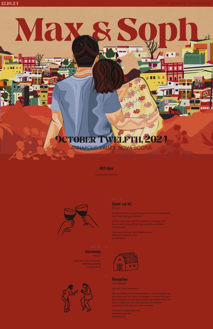
Max & Soph’s Modern Wedding Website
This modern wedding website is a perfect example of bold, personality-driven design paired with smart functionality. From its illustrated header and rich color palette to its clean layout and custom icons, every element reflects the couple’s creative style.
Why it works:
- Visually striking without sacrificing usability
- Strong typography and a cohesive color scheme
- Easy-to-scan sections like schedule, dress code, and transport
- A modern map illustration enhances the destination wedding vibe
WedSites template used: Byron
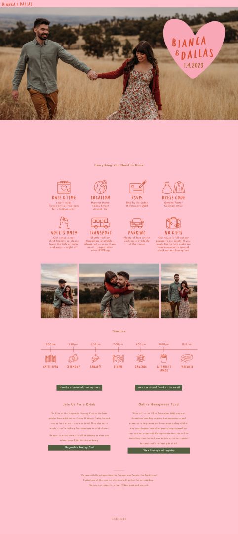
Bianca & Dallas’ Colorful Wedding Website
Bianca and Dallas’ colorful wedding website design leans into a bold, modern aesthetic. The pink background, oversized heart logo, and clean iconography give it instant personality, while the minimalist layout keeps everything easy to scan.
Why it works:
- Bold use of color and playful graphics create a strong, cohesive visual identity
- Custom icons help convey key info quickly and clearly
- Clean, minimalist layout makes the site easy to navigate
- Friendly and informal copy reflects the couple’s relaxed vibe
- Olive green buttons add contrast to the pink palette
WedSites template used: Byron

Ross & Hannah’s Playful Wedding Website
This playful wedding website proves that sleek doesn’t have to mean serious! With its punchy color palette, quirky illustrations, and bold use of type, this design captures the couple’s fun-loving energy while staying organized and easy to follow.
Why it works:
- Bold headings and section titles make key info pop
- Vibrant colors and playful icons keep the tone upbeat and engaging
- Each section is neatly segmented for easy scrolling on mobile
- Custom fonts and illustrations add personality without clutter
WedSites template used: Dauphin
Classic & Elegant Wedding Website Design Examples
If you’re after elegant wedding website inspiration, these classic designs are for you. Featuring timeless fonts and soft color palettes, these website examples work beautifully for traditional weddings, ballroom venues, or black-tie events.
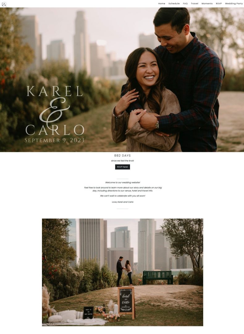
Karel & Carlo’s Classic Wedding Website
This elegant wedding website design blends modern romance with a clean, editorial aesthetic. Featuring full-width photos, serif fonts, and well-spaced content blocks, the site feels sophisticated yet warm.
Why it works:
- Banner images and minimalist layout create a high-end, editorial feel
- Clear navigation with labeled tabs (Schedule, FAQ, RSVP) enhances usability
- The “Tidbits” section gives personality while keeping the tone polished
- Thoughtful typography and spacing improve readability across devices
WedSites template used: Dauphin
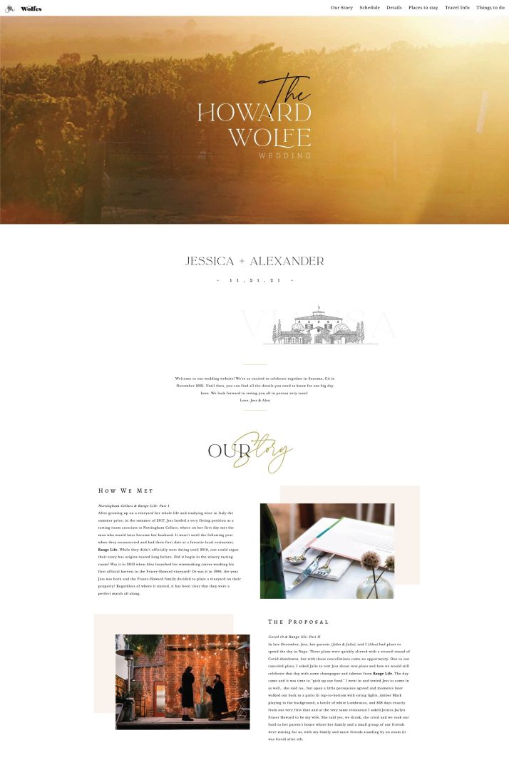
Jessica & Alexander’s Vineyard Wedding Website
This dreamy wedding website is a beautiful example of clean and elegant design done right. Set against a romantic vineyard backdrop, the layout combines soft imagery, classic typography, and thoughtful storytelling.
Why it works:
- A cinematic hero image immediately sets a romantic, elevated tone
- Serif fonts paired with script accents create a classic, elegant aesthetic
- Structured sections like “Our Story,” “The Wedding Party,” and “The Details” guide guests seamlessly
- Neutral colors and generous white space keep the layout clean and easy to read
WedSites template used: Melbourne
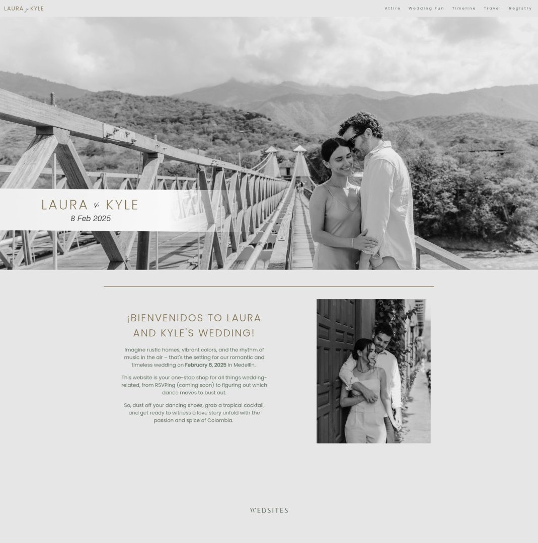
Laura & Kyle’s Elegant Wedding Website
Laura and Kyle’s classic wedding website blends timeless elegance with thoughtful simplicity. From the romantic black-and-white photography to the soft neutral background, every element comes together beautifully.
Why it works:
- Monochrome imagery and muted tones create a timeless, high-end feel
- Sophisticated serif fonts add elegance and readability
- Clean, well-spaced layout makes navigation effortless
- Subtle gold accenting adds polish without overpowering the design
WedSites template used: Constanta
Minimalist Wedding Website Design Examples
These minimalist wedding website examples show how less really can be more! Ideal for couples who want a clean, simple and clutter-free layout that puts their wedding details front and center.
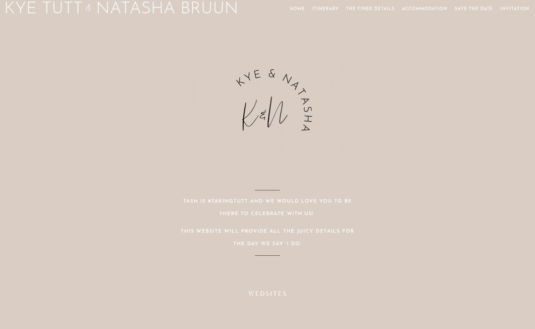
Kye & Natasha’s Minimalist Wedding Website
With a soft neutral background and personalized monogram, this minimalist wedding website feels effortless and elevated. The homepage delivers the essential message without clutter, making a stylish first impression that’s equal parts chic and personal.
Why it works:
- Monochromatic palette and clean layout for a modern, minimalist feel
- Simple typography and subtle logo design add elegance without overcomplication
- Streamlined copy keeps the focus on what matters most
WedSites template used: Denver
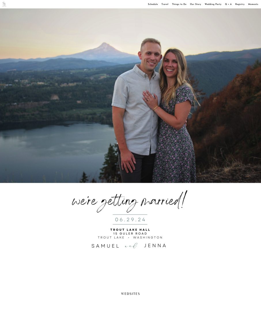
Samuel & Jenna’s Simple Wedding Website
Clean, calming, and beautifully balanced, this simple wedding website lets the scenery (and the couple) take centre stage. The large hero image paired with generous white space is proof that simple doesn’t mean boring – it means thoughtful.
Why it works:
- Striking full-screen photo sets the tone immediately
- Minimal text on the homepage keeps the focus on the essentials
- Light, modern fonts feel airy and romantic
- Ample white space adds visual clarity
WedSites template used: Denver
Romantic & Boho Wedding Website Design Examples
Planning a romantic or bohemian wedding celebration? These boho wedding website examples feature warm tones, organic textures, earthy colors and whimsical design elements.
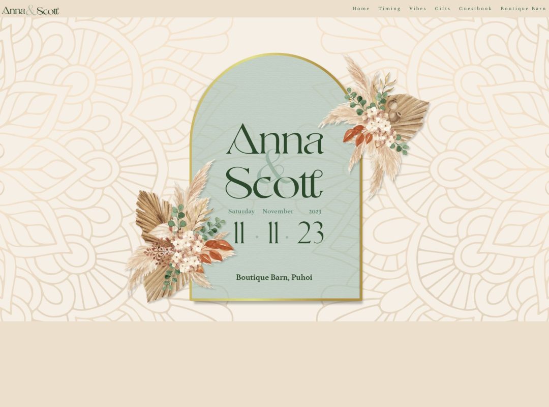
Anna & Scott’s Boho-Inspired Wedding Website
With dreamy textures and delicate floral details, this boho-inspired wedding website is a beautiful showcase of romance with a rustic twist. The soft, earthy color palette paired with illustrated motifs come together effortlessly for a cohesive, polished look.
Why it works:
- Decorative typography and floral elements reflect the couple’s romantic vibe
- Cream and sage tones create a calm, organic feel that still looks elevated
- Dedicated “Vibes” section with a mood board adds personality and inspiration
- Elegant scroll layout helps break up info while keeping it visually engaging
WedSites template used: Byron
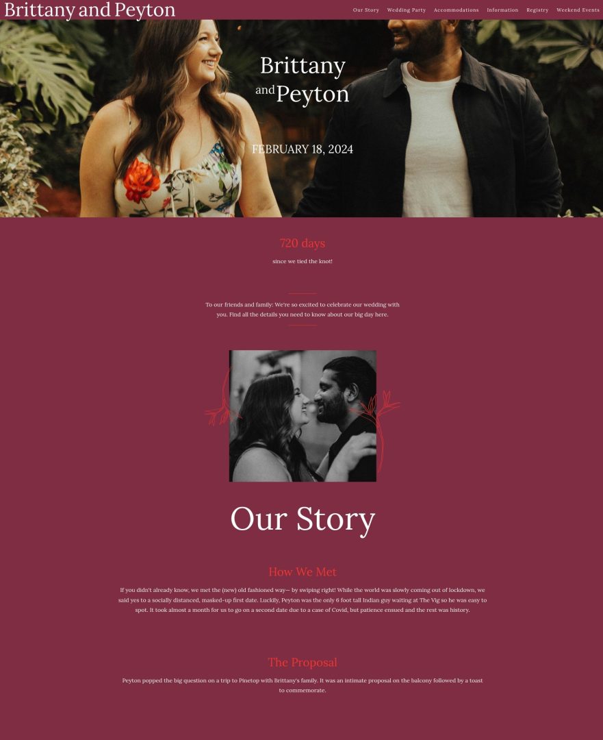
Brittany & Peyton’s Romantic Wedding Website
With its rich burgundy palette and full-screen imagery, this romantic wedding website leans into a moody, heartfelt vibe. The color palette immediately sets the tone, while the couple’s story and wedding party details are laid out with personality.
Why it works:
- Deep, romantic colour scheme creates a bold but intimate feel
- Personalized content (like proposal details and bridal party bios) adds a heartfelt touch
- Structured layout with defined sections keeps it easy to navigate
- Serif headings and floral accents elevate the overall aesthetic
WedSites template used: Denver
Destination Wedding Website Examples
Destination wedding websites need to do more than look good – they need to be functional! These destination wedding website examples show how WedSites couples have used our templates to share travel details, accommodation info, multi-day itineraries, and RSVP forms all in one place.
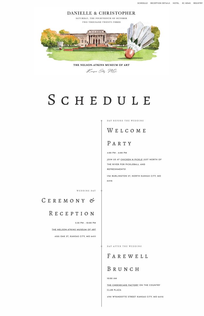
Danielle & Christopher’s Destination Wedding Website
This elegant destination wedding website is both beautiful and easy to use. It gives guests everything they need to plan their trip, with a clear schedule and helpful local tips.
Why it works:
- Custom venue artwork sets the tone from the start
- Simple fonts and layout feel polished but not overwhelming
- Itinerary and reception info are clear and easy to follow
- Local recommendations add a personal, helpful touch
- Separate travel and home registry links are convenient for guests
WedSites template used: Denver
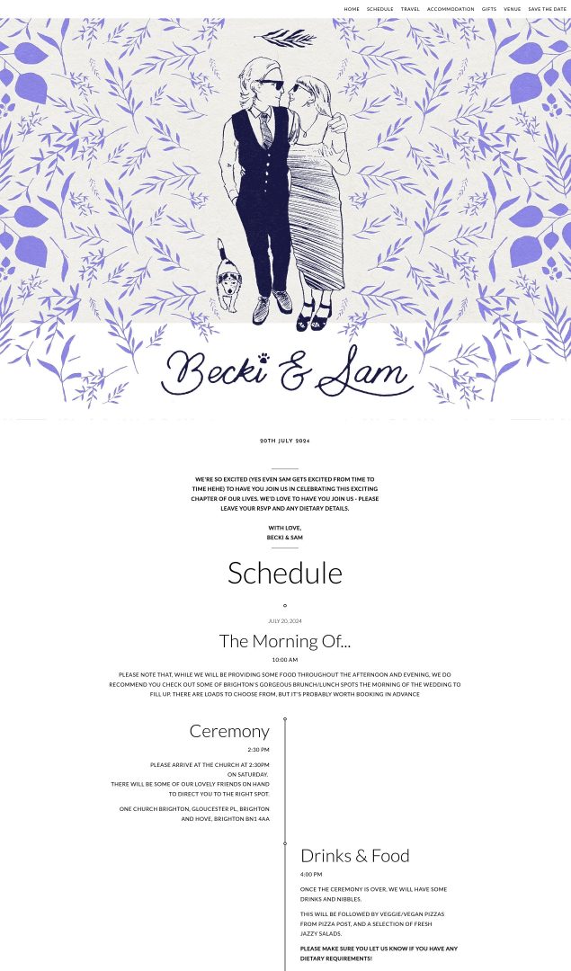
Becki & Sam’s Destination Wedding Website
This destination wedding website perfectly captures the couple’s personality while still keeping things simple and informative. The timeline layout makes the day easy to follow, and helpful tips around transport and accommodation are clearly laid out.
Why it works:
- Uses a simple vertical timeline to show the flow of the day
- Travel and accommodation info is split into clear, scannable sections
- Gift wording feels personal and pressure-free
- Venue details are easy to find at the bottom
- The illustrated banner at the top adds a unique, creative touch
WedSites template used: Denver
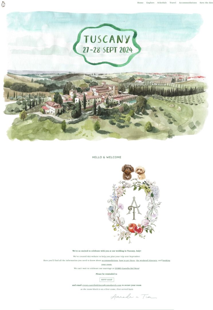
Amanda & Tim’s Destination Wedding Website
This Tuscany-inspired destination wedding website feels calm, thoughtful, and easy to navigate. The watercolor illustrations add a personal touch, while the step-by-step instructions and reminders keep guests on track.
Why it works:
- Watercolor header and crest create a soft, romantic tone
- Clear headings guide guests through each next step
- Timeline layout helps break down RSVP and room booking tasks
- Travel and accommodation details are linked early for easy planning
WedSites template used: Sofia
FAQs About Our Wedding Website Templates
Yes! Unlike other platforms, all of our wedding website templates can be fully customized with fonts, colors, images, layouts, and digital artwork using our drag-and-drop website builder. This means no two sites are ever the same, and you have complete creative freedom over the design elements.
Absolutely. All templates are responsive, so your site will look great on phones, tablets, and desktops.
They sure do. You can add RSVP forms, multiple event pages, accommodation info, and anything else you (and your guests) might need.
Definitely. Think of our templates as a starting point. You can customize them as much (or as little) as you like to make your site one-of-a-kind.
Yes – you can change templates at any time without losing your content.
Yes! Each wedding website template comes with matching paperless stationery, so you can send digital invitations and save the dates for a cohesive look.
Browse our range of wedding website templates here to find your perfect match, and sign up for your free account to start building your site.
Looking for wedding website wording examples? Read our guide: How to Write Your Wedding Website Sections.